La Vie De Luxe operates within the ultra-high-net-worth market, sourcing and brokering superyachts and private aircraft tailored to individual client specifications.
We created a complete brand identity designed to position the firm as a discreet and highly specialised boutique brokerage operating across sea and sky.
The new visual system conveys the exclusivity, precision, and modern luxury of the La Vie De Luxe brand.
Branding
The Mark
The Logo
The primary logo combines the circular brand marque with a refined wordmark, supported by secondary lockups for centred and balanced applications.
What Inspired The Logo?
The marque combines abstract wave forms representing the bow of a yacht with upward lines inspired by aircraft wings, symbolising movement across sea and sky.
What Does The Brand Marque Represent?
The circular symbol reflects the seamless integration of yacht and aviation brokerage services, with flowing lines communicating motion, precision, and discretion.
Three Versions
The primary lockup sets the marque beside the wordmark; the marque and the wordmark also stand alone. Try them.
The Type
Bellet
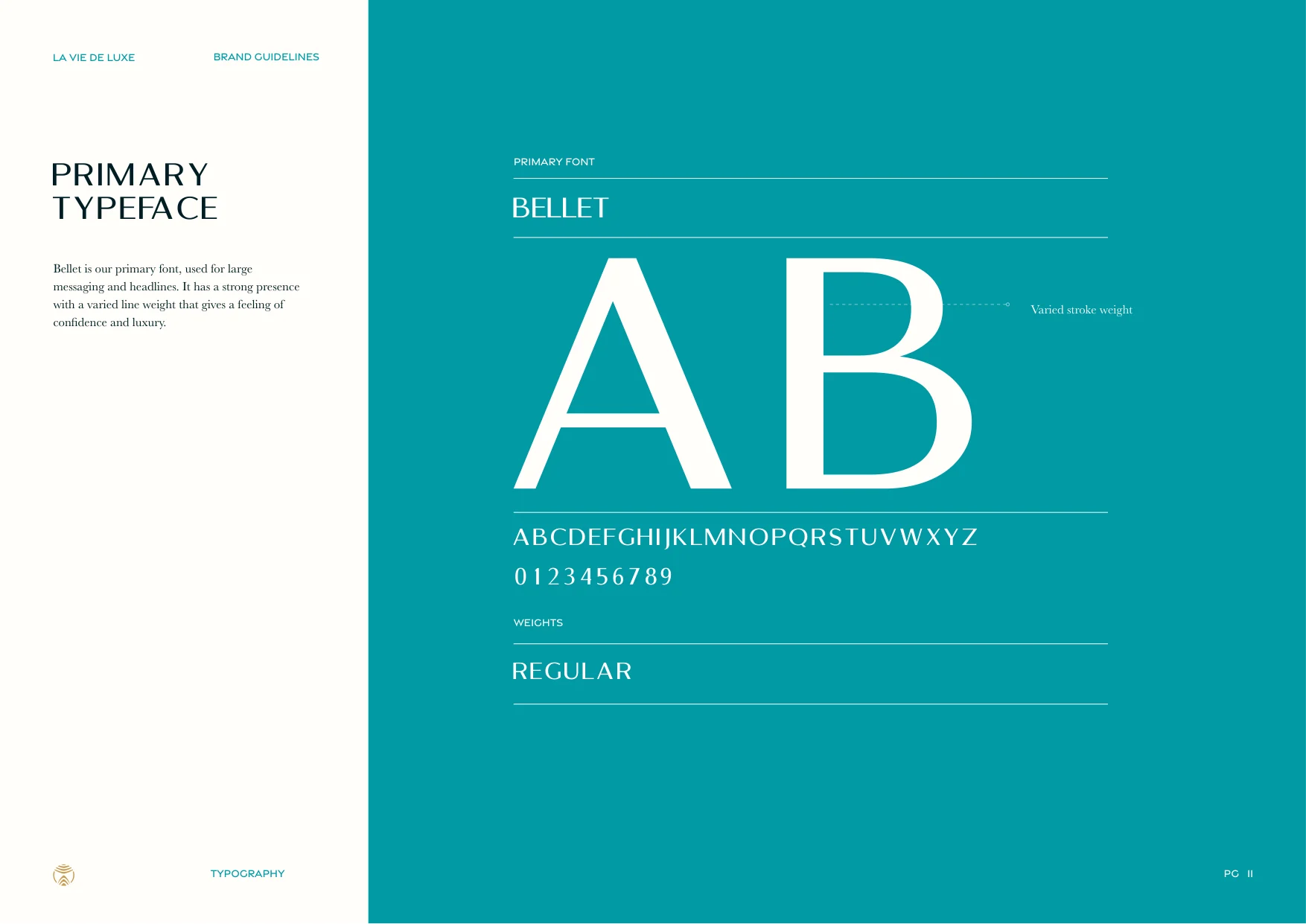
Bellet carries the headlines: large, light and widely tracked, with a varied stroke weight that gives a feeling of confidence and luxury.
Baskerville
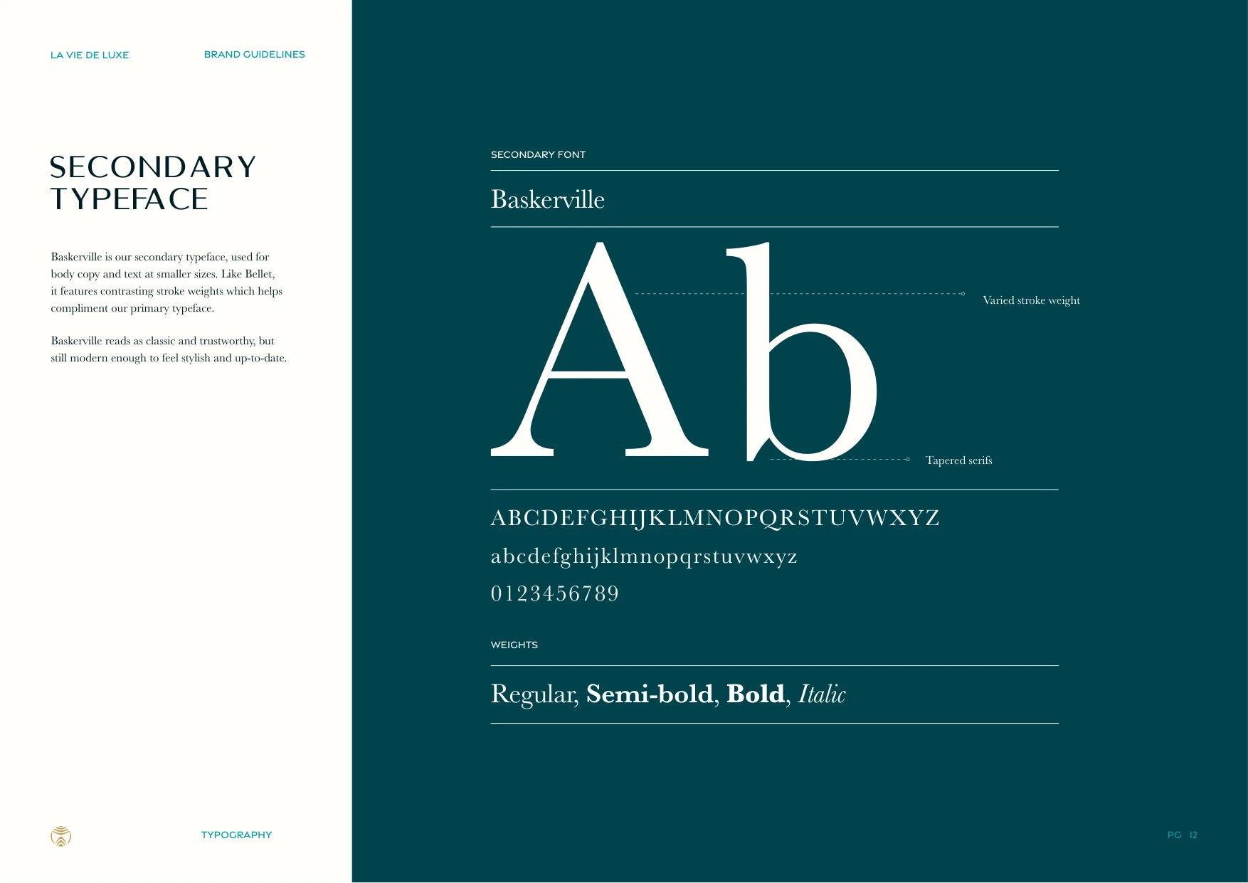
Baskerville sets the body copy, classic and trustworthy, in Regular, Semi-bold, Bold and Italic.
Gravesend Sans
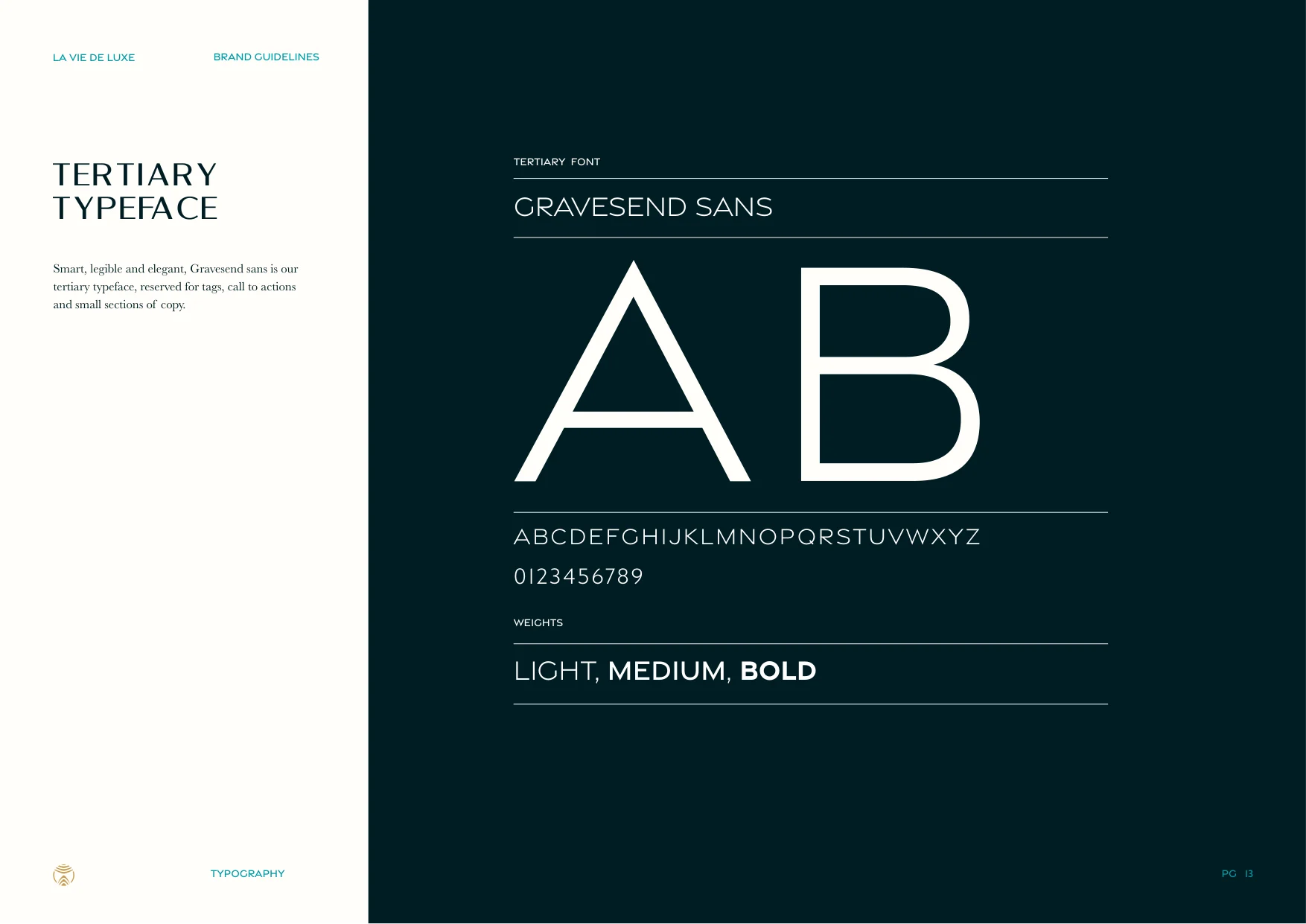
Gravesend Sans handles tags, calls to action and small labels, smart and legible in capitals.
The Hierarchy
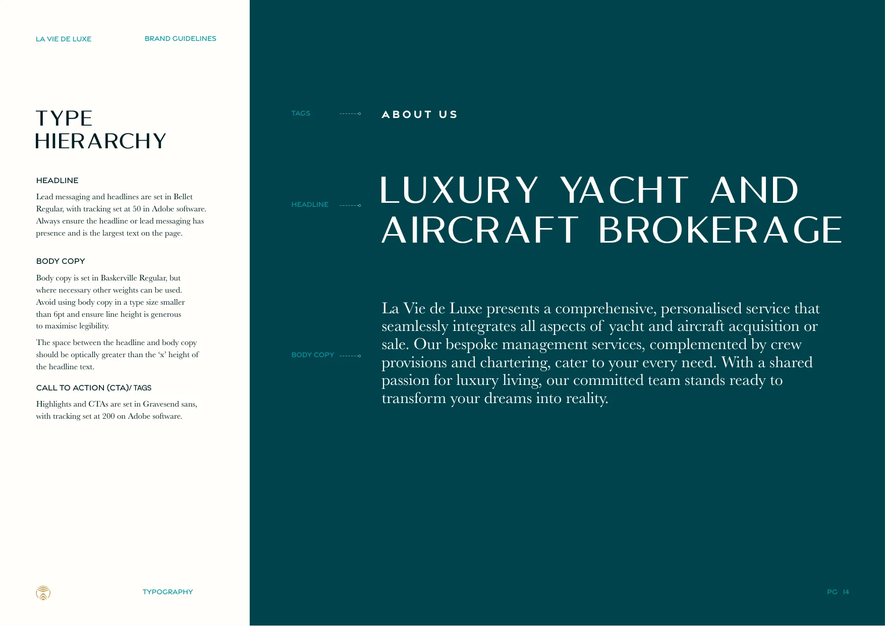
Headline, body and tags set out in order, so every message reads as quietly as the brokerage itself.
The Colour
The Palette
Ocean blue, teal, deep navy, and near-white form the core palette, with gold used sparingly as a premium accent to elevate key brand moments.
Sea And Sky
Ocean Blue, Teal Blue, Deep Navy and Almost White are the primary colours, used across every design.
Gold, Sparingly
Gold is the accent, kept to small areas and key brand moments, never large expanses.
The Graphic Devices
Drawn From The Marque
The marque splits into two devices: the waves of a yacht’s wake, and the rising lines of a bow or a wing.
Depth, Not Decoration
Set large and faint, they add depth to a background, each ground with its own tint. Try them.
The Brand In Use
The Device At Work
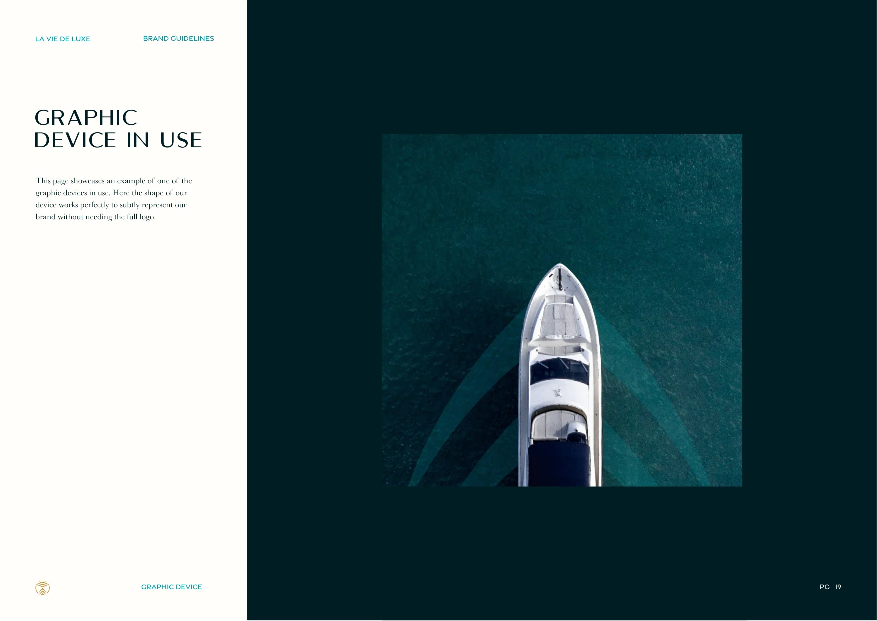
Over a yacht seen from above, the wake device extends the line of the boat itself, without needing the full logo.
On Screen
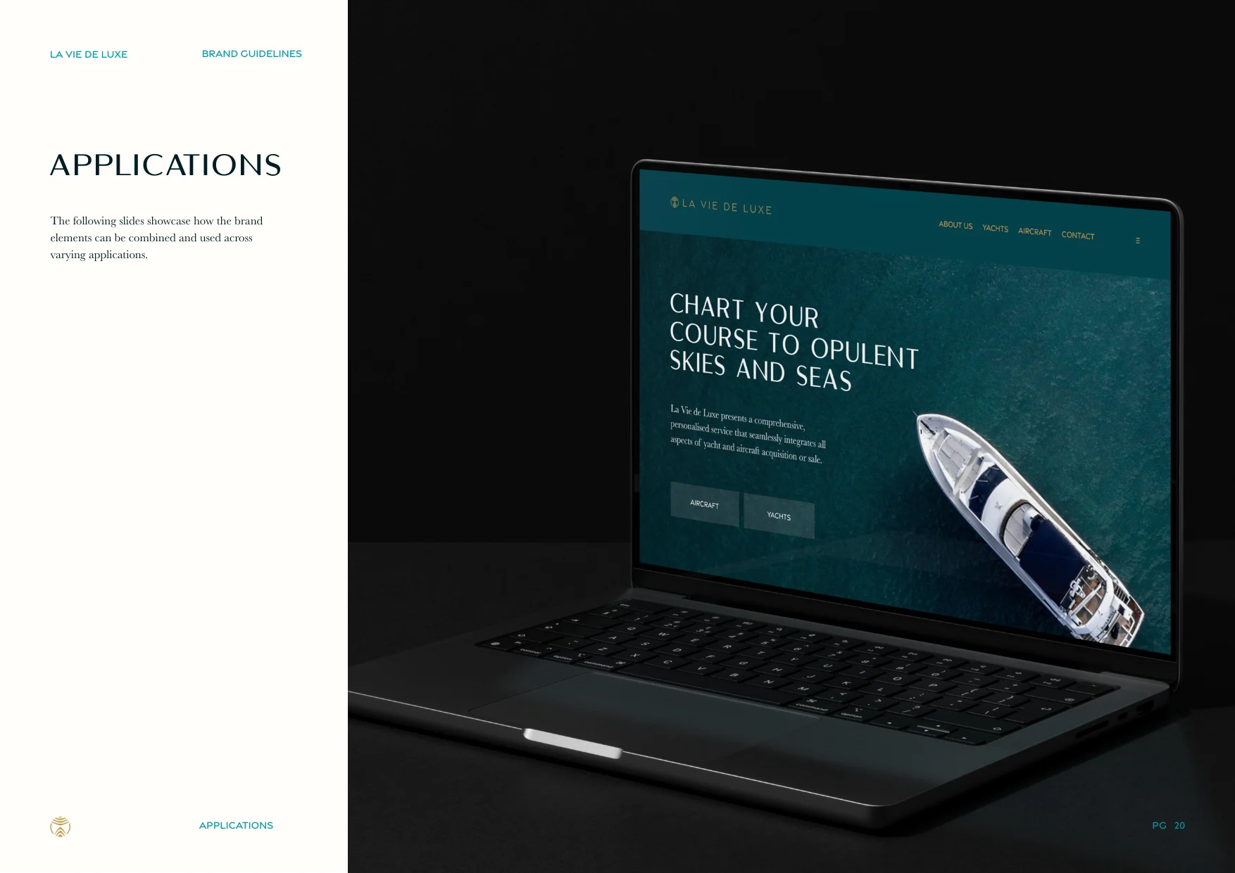
A website concept carries the palette, the type and the device into the digital space.
Social
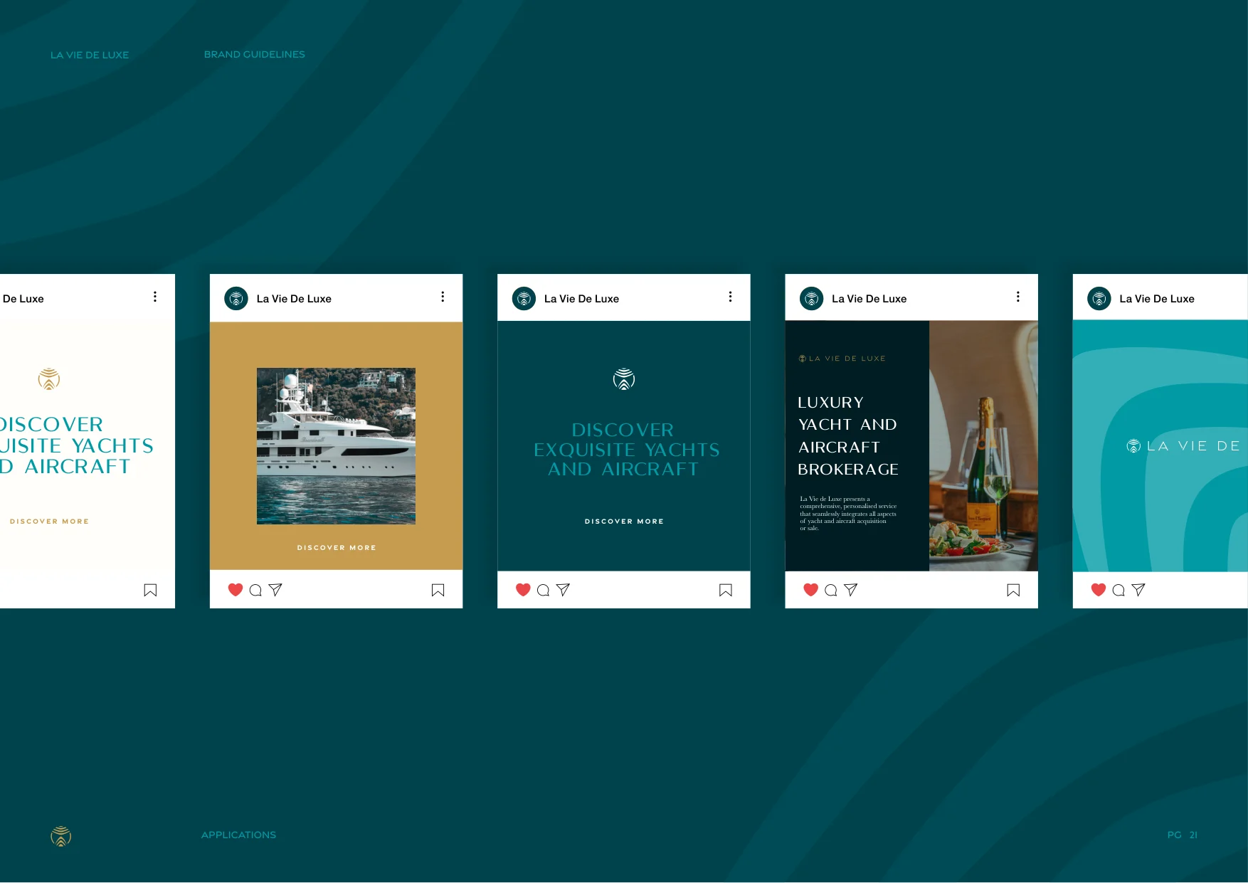
Post templates move between Gold, Teal Blue and imagery while keeping the same quiet voice.