Our Work/ACRE Consultancy
ACRE Consultancy.
Independent chemical regulatory consultancy guiding manufacturers, importers, formulators, and distributors worldwide through UK REACH and EU REACH compliance.
- Services
- Branding, Web Design
- Sector
- Regulatory Consultancy
Based on the edge of the New Forest, ACRE had grown through referrals and needed a brand and website that reflected its expertise and could generate new enquiries.
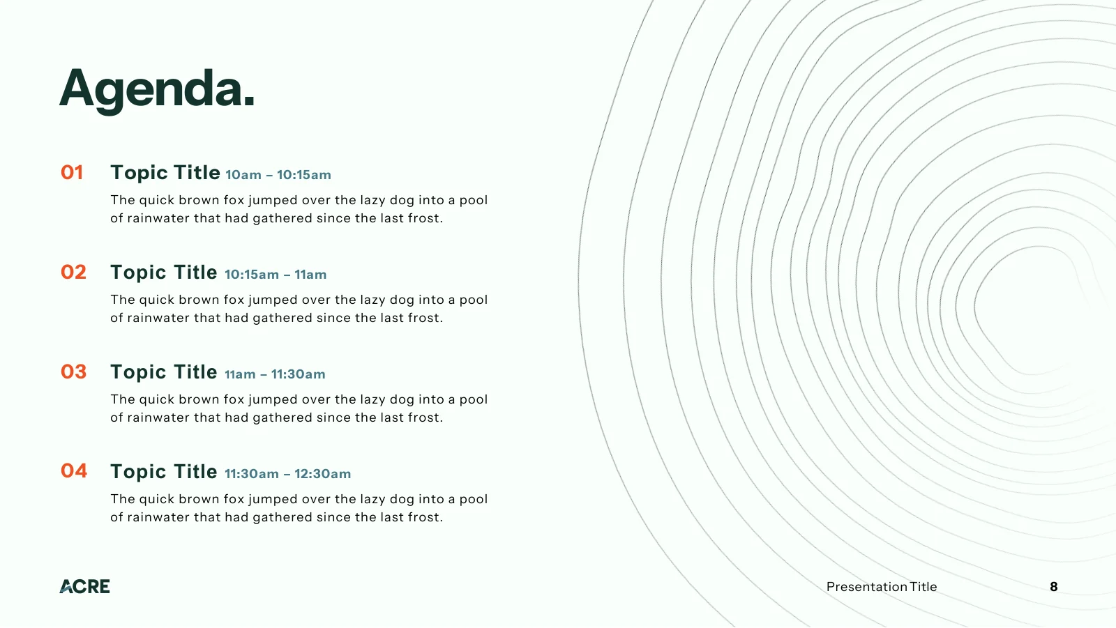
We refreshed ACRE's brand and designed a bespoke website, then rolled the new identity out across brand guidelines, presentation and LinkedIn templates, business cards, and exhibition stand artwork.
The result is a confident, professional brand presence, launched across print, digital, and event materials in time for ACRE's first major exhibition at CHEMUK 2026.
Website Design
Services A Buyer Can Find
Most of ACRE’s clients know their problem before they know the service. Hover a service, or browse the line.
Plain-English Services
Each service line says what ACRE does, so a visitor who arrives with a problem rather than a service name finds the right start.
A Page Per Service
Every card leads to a service page: what’s included, the difference it makes, and what working with ACRE looks like.
Approachable By Design
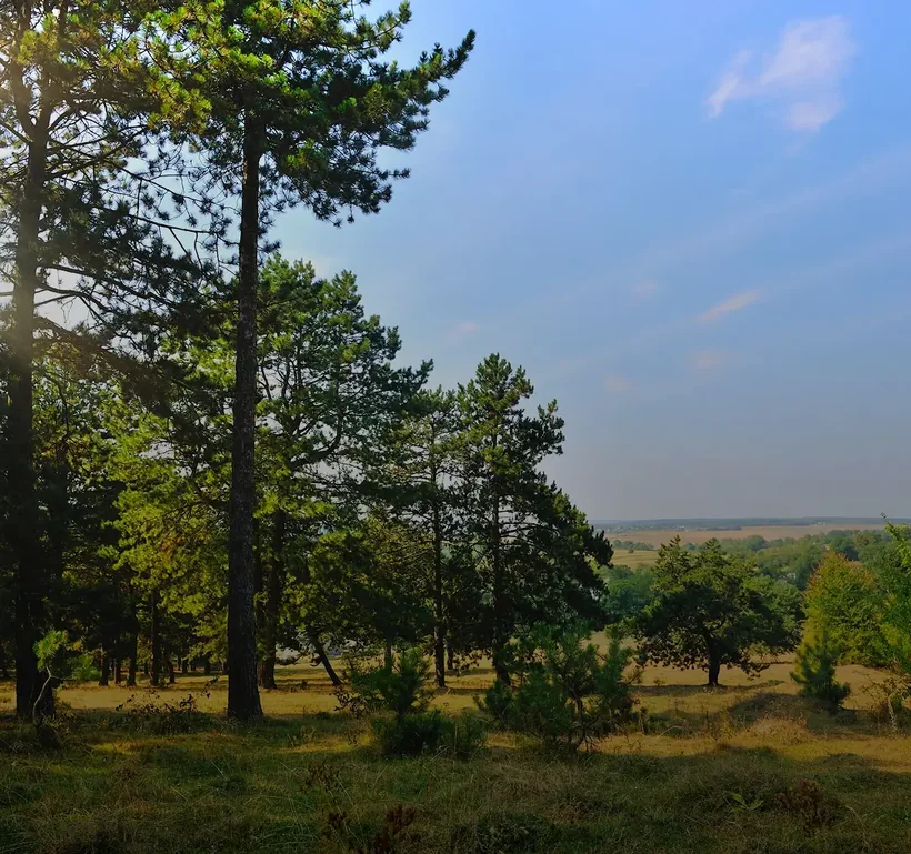
Woodland imagery and a calm, uncluttered slider make a complex regulatory offer feel approachable.
What we do
Chemical regulatory support for EU and GB REACH.
Regulatory Strategy & Advisory Services
Clear priorities and steady regulatory leadership.
Learn More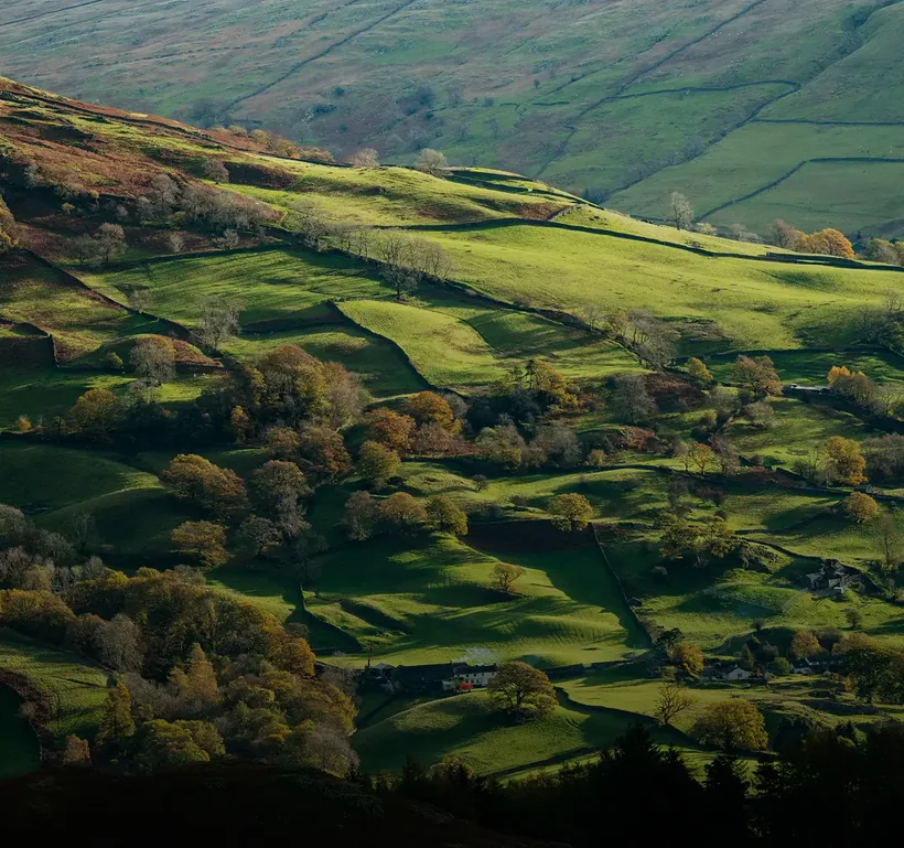
Registration, Documentation & Technical Submissions
Robust dossiers, from data gaps to delivery.
Learn More
Consortium & Data Management
Shared data, agreements and submissions, coordinated.
Learn More
Representative Services
Only Representative services for market access.
Learn More
Chemical Stewardship Support
Practical support with stewardship responsibilities.
Learn More
A Menu That Explains Itself
ACRE’s buyers arrive with a regulatory problem, not a service name. The menu meets them there.
A Line Under Every Service
Buyers often know their problem before they know the service, so every service carries a short plain-English description.
One Menu, Every Route
The Services menu opens the whole offer in one view, from strategy to Only Representative services.
Separate REACH Pages
UK and EU REACH have their own pages, matching how buyers search by jurisdiction.
- Regulatory Strategy & Advisory ServicesGuidance to prioritise actions and plan ahead.
- Consortium & Data ManagementCoordinated data, agreements and submissions.
- Chemical Stewardship SupportHelp with stewardship responsibilities.
- Registration, Documentation & Technical SubmissionsSubmissions prepared to stand up to scrutiny.
- UK REACH Only RepresentativeGB market access for non-GB manufacturers.
- EU REACH Only RepresentativeEU market access for non-EU manufacturers.
How It Was Built
We built a custom WordPress website that turns a complex regulatory offer into a clear and credible experience, carrying the new ACRE brand through every page.
User Experience
A descriptive mega menu, grouped service landing pages, and well-structured service pages guide visitors from their regulatory challenge to the right support and a simple enquiry.
Mobile Responsive
Navigation, service pages, FAQs, and the enquiry form were built to stay legible and usable across mobile, tablet, and desktop, with WebP images and a light script footprint keeping pages lean.
Interactive Design
A looping woodland hero video, a closing call-to-action video, and a header logo that switches to the compact mark on scroll add movement and polish without distracting from the content.
Branding
The Mark
The Logo
The curved sweep of the A gives the wordmark a distinctive, modern detail drawn from ACRE's original logo, with refined letterforms set at an equal height so it reads like a stamp.
What Inspired The Logo Concept?
The logo evolves ACRE's original mark rather than replacing it, with a curved sweep across the A giving the wordmark a contemporary edge while keeping the meaning behind the original design.
Two Versions
The full version keeps the Consultancy sub line to set ACRE apart from similarly named businesses, while a compact mark works at smaller sizes.
Colourways
Two duotone versions and six approved pairings keep the logo clear on every background. Try them.
The Type
One Typeface
A single primary typeface sets a consistent hierarchy, with Bold for headlines, Regular for body text, and Extra Bold for calls to action, while Instrument Sans is specified as a free alternative.
The Hierarchy
Set with ACRE’s own lines: a Bold headline, Regular body text, and a heavier weight for the call to action.
The Colour
The Palette
Three teals and Soft White give the brand a steady, assured foundation, while a bold orange accent adds energy to highlights and calls to action.
Three Teals
Three teal shades form the foundation of the palette and may take leading roles across applications.
Black And Soft White
The neutral tones, providing balance and contrast throughout the visual system.
Orange, Sparingly
A vibrant orange is the accent: used sparingly, and never as the dominant colour in any design.
The Tree Rings
What Does The Tree-ring Graphic Represent?
The tree rings nod to ACRE's roots in the Avon Valley and the New Forest and to the natural world it works to protect, and are used as a subtle, off-centre background in solid or faded form.
Device Colourways
The rings take the colour that suits their background, so they stay visible, and text set over them stays legible. Try the approved pairings.
The Brand In Use
How Was The Brand Rolled Out?
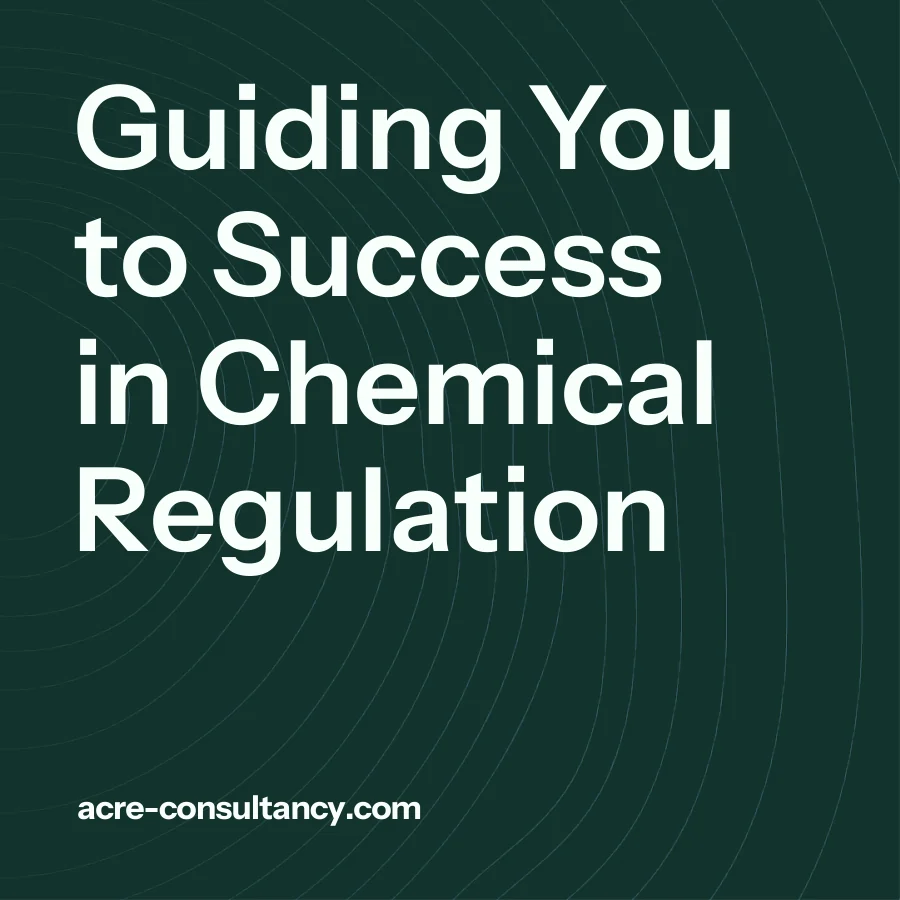
We applied the identity across a presentation template, a LinkedIn kit, business cards, video-call backgrounds, exhibition pens, and the ACRE stand for CHEMUK 2026 at the NEC Birmingham.
LinkedIn Kit
Square posts that carry the brand, and its tree rings, into ACRE’s LinkedIn and event activity.