Our Work/BGI
BGI.
Global capital advisory firm connecting high-growth ventures with strategic investors across international markets.
- Services
- Branding, Web Design
- Sector
- Financial Services
Bryn Group Investments (BGI) is a specialist fundraising consultancy working with ambitious ventures across sectors, including e-mobility, energy storage, disruptive technology, and sustainability.
We delivered a complete brand identity and website redesign that positions BGI as a high-end capital advisory partner connecting ventures with global investment networks.
The result is an online presence that clearly communicates the firm’s credibility and strategic role in facilitating investment relationships.
Branding
The Mark
The Logo
The logo combines a clean wordmark with a distinctive wolf marque to create an unmistakeably recognisable identity. The split construction of the symbol represents the balance between instinct and analytical market intelligence.
What Does The Wolf Symbol Represent?
The wolf reflects BGI's positioning as agile, focused, and effective - qualities essential in successful fundraising and deal execution.
How Does The Logo Reference The Finance Industry?
The wolf head is split in two, with one half constructed through bar elements that subtly reference financial charting and investment growth.
Colourways
White on the deep greens and mist blues, Forest Green on the light sands. Try them.
The Type
Two Typefaces
Neuzeit Grotesk is used for lead messaging and headlines to deliver a clean, contemporary tone.
Brother 1816
Brother 1816 supports body content with clarity and readability.
The Hierarchy
Headlines in Neuzeit Grotesk Regular, tightly tracked; body copy in Brother 1816 at a much smaller size, with generous line height.
The Colour
The Palette
Forest green forms the foundation of the brand, supported by mist blues and sand tones for balance. Ice blue is used sparingly as an accent colour to highlight key elements and calls to action.
Deep Shades
Forest Green is the foundation, with Black and Off-White for contrast.
Mist Blues And Sands
Icy blues and sandy shades, drawn from mountain ranges and woodland, keep the palette calm and natural.
A Streak Of Ice
Ice Blue is the accent, used sparingly to pick out key items.
The Graphic Device
The Logo’s Angles
The device mirrors the angles of the wolf: a parallelogram that can be scaled freely, as long as the angles hold.
A Container
It holds images or text, shapes a layout and divides space, so every page carries the wolf’s geometry.
Your strategicpartner in globalfundraising
The Brand In Use
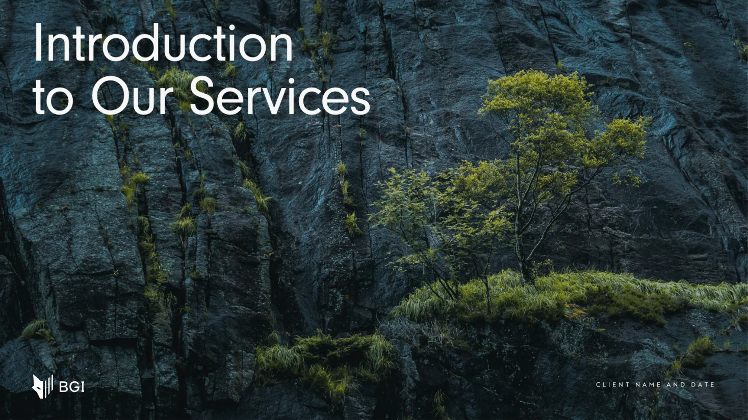
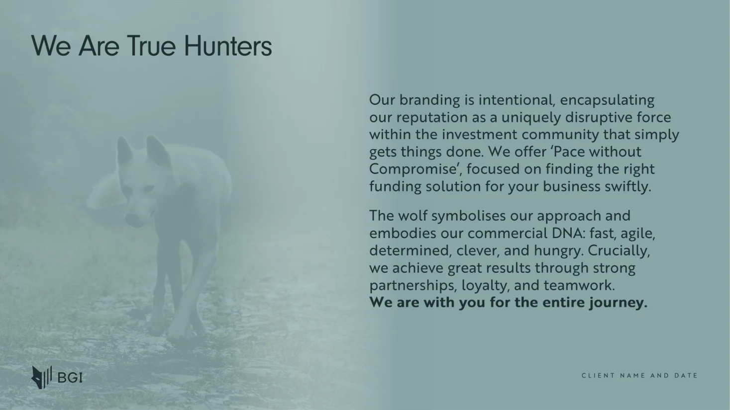
A Presentation Template
A pitch deck in the brand, from the cover to the closing statement, for BGI’s investor and client meetings.
The Wolf, Explained
The deck tells the brand’s story in its own words: fast, agile, determined and effective, with clients for the entire journey.
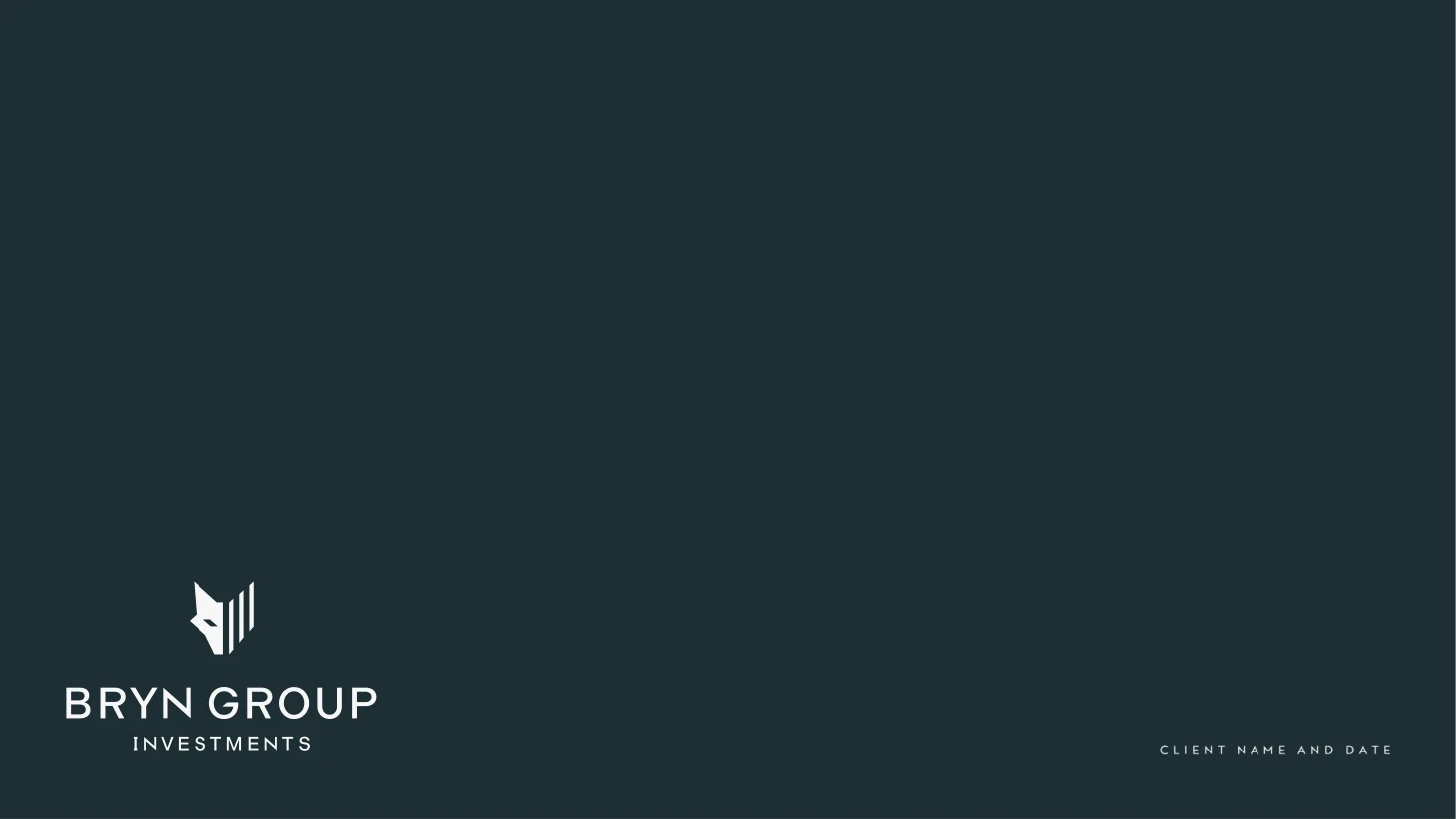
Bryn Group Investments
The full name carries the formal lockup, for audiences meeting BGI for the first time.
Website Design
How It Was Built
We developed a bespoke website that presents Bryn Group’s capital advisory work with greater clarity and authority, helping founders and investors evaluate the firm as a potential partner.
User Experience
Simple navigation and structured content flow guide users naturally through BGI’s proposition and capital advisory methodology.
Mobile Responsive
Layouts, typography, and content hierarchy were optimised to maintain impact and legibility across mobile, tablet, and desktop devices.
Interactive Design
Subtle graphic devices and layered visual elements introduce depth and visual interest while maintaining a clean and professional aesthetic.
The team's personability, understanding of our culture, and their care and passion for our project impressed us.

Roy Davies
Business Relationship Manager