allPlanning.
Planning consultancy helping homeowners, developers, and architects navigate planning permission for residential projects across London and the UK.
Planning consultancy helping homeowners, developers, and architects navigate planning permission for residential projects across London and the UK.
allPlanning provides specialist planning advice and support for residential developments, guiding clients through the complexities of the UK planning system.
With deep experience working alongside local planning authorities, allPlanning helps homeowners and developers improve their chances of securing planning permission.
We designed a modern brand identity and delivered a bespoke website to position allPlanning as the clear trusted partner for those navigating an often technical and complicated process.
We designed and developed a bespoke website that clearly presents allPlanning’s services and recent project outcomes, guiding prospective clients towards booking a free consultation.
The homepage introduces the firm’s core services, including planning advice, planning applications, appeals, and specialist support. Dedicated project pages highlight successful developments and planning outcomes, while dynamically integrated reviews from Google and Bark reinforce credibility throughout the site.
Clear structure and calls to action encourage visitors to initiate the consultation process through a streamlined enquiry form that quickly and easily allows prospective clients to get in touch and begin the planning process.
The website was designed to make the planning process feel more accessible and less overwhelming for homeowners unfamiliar with the planning process. Clear navigation, project examples, and visible proof of successful outcomes help build trust and encourage enquiries.
The website is fully optimised for mobile, ensuring visitors can review services, browse project examples, and submit consultation enquiries easily from any device.
User Experience
Simple navigation, structured service pages, and visible calls to action guide users naturally from learning about planning services to submitting an enquiry.
Mobile Responsive
Every page is fully responsive, ensuring service pages, project examples, and enquiry forms function seamlessly across mobile, tablet, and desktop devices.
Interactive Design
Subtle hover states, dropdown navigation, and integrated review feeds introduce visual polish while maintaining a clean, professional look and feel.
"The development process was exemplary - I was regularly impressed by the team's creative approach to any conundrums or problems that arose. Even when a satisfactory result had been arrived at, Samuel and his team were always looking for ways to improve and strive for the optimum outcome."

Rob Hewson
Director, allPlanning
We created a modern brand identity centred on the concept of approval and progress, using a distinctive tick device to represent successful planning outcomes.
The identity balances professionalism with approachability, ensuring the brand feels credible and reassuring to prospective clients navigating the planning process.
The colour palette centres around black and white with a mint accent to introduce a fresh, modern feel, supported by grey and orange highlights used selectively across applications. Typography uses Sofia Pro across headings and body copy for clarity and structure, with Sofia Soft reserved specifically for the logo.
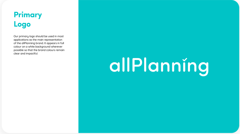
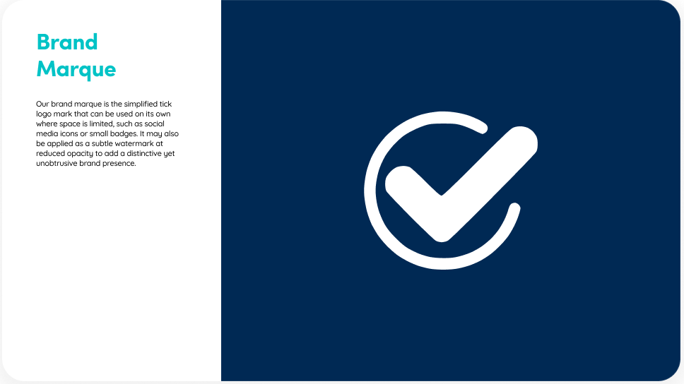
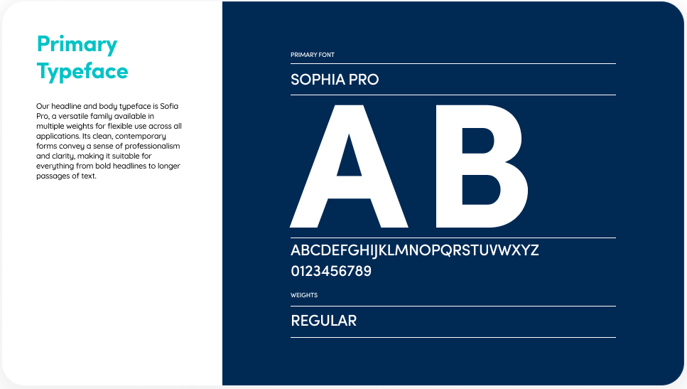
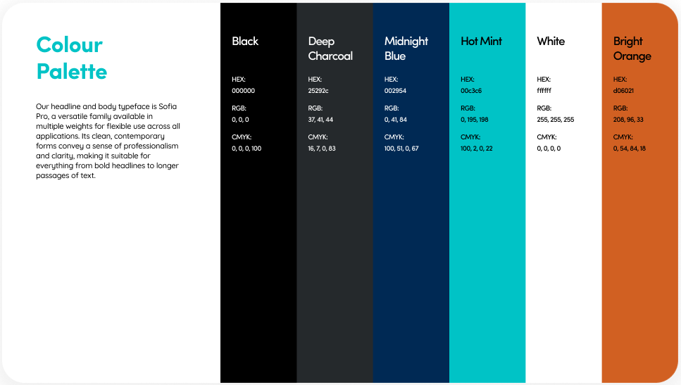
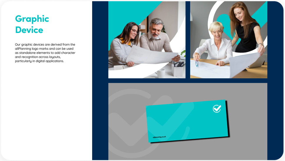
We developed comprehensive visual guidelines covering logo usage, spacing, colour palette, typography, and design elements to ensure consistency across print and digital applications.
Logo
The primary wordmark features the tick above the “i”, supported by a circular marque where the tick runs through an open form, creating a recognisable standalone symbol.
Typeface
Sofia Pro is used across headings and body content to maintain clarity and consistency, while Sofia Soft is reserved exclusively for the logo.
Colour Palette
Black and white form the foundation of the identity, with mint used as the primary accent and grey and orange tones used selectively for emphasis.