Our Work/Precise Life
Precise Life.
Independent insurance broker providing clear, tailored protection solutions across life, mortgage, income, and critical illness cover.
- Services
- Branding, Web Design
- Sector
- Financial Services, Insurance
As an insurance broker, Precise Life needed a brand identity and website that stood apart from the typically corporate and jargon-heavy insurance market.
We developed a full brand identity and a bespoke website centred around clear messaging, service-led illustrations, and a confident but approachable tone.
The result is a distinctive digital platform that simplifies complex products while making the brand memorable and easy to engage with.
Website Design
A Quote Form That Qualifies
The enquiry form asks what an adviser needs to know first. Pick a type of cover, or two.
The Cover, Up Front
Visitors say which cover they need before anything else, so an adviser knows what the conversation is about before it starts.
Qualified, Not Just Captured
Smoking status changes every quote, so it’s asked here rather than on the first call.
Or Just Talk
Visitors who’d rather not fill in a form start a WhatsApp conversation in one tap.
Get Your No-Obligation Quote Now
- Individually tailored policies
- Quotes from five-star rated providers
- No-obligation financial advice
Cover Explained, One Type At A Time
Insurance buyers want to know what they’re buying. Every type of cover gets its own page and its own character. Switch between them.
A Page Per Cover Type
Each type of cover has its own page, its own explanation and its own route to a quote.
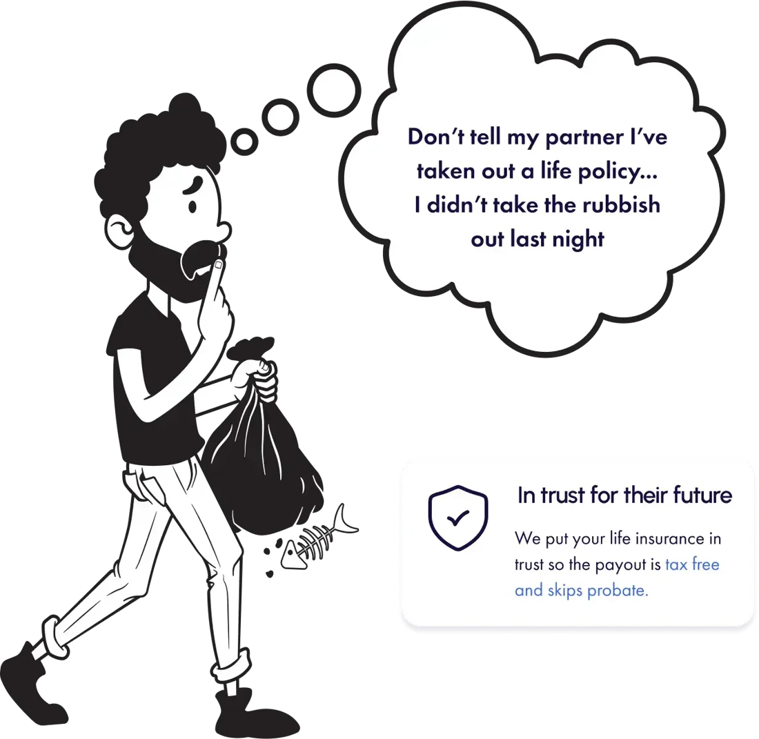
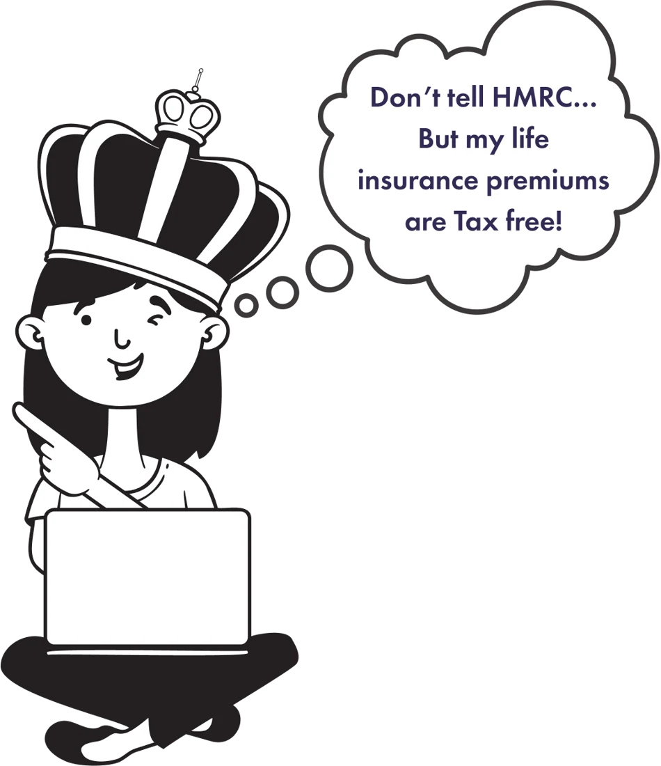
Illustrated, Not Stock
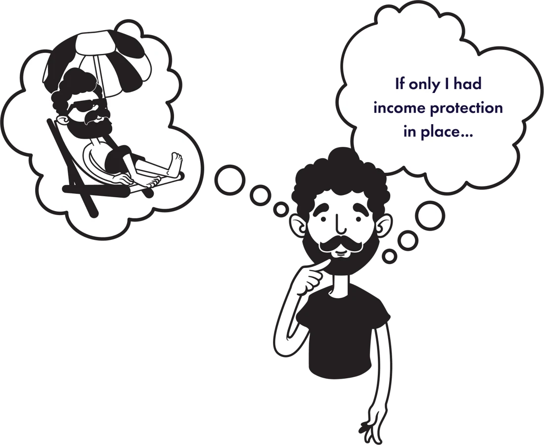
Every page leads with a character from the brand’s own illustration set, with a thought that makes the risk real and the tone human.
Life Insurance
A tax-free lump sum for your family if the worst happens.
- Financial security for loved ones
- A tax-free lump sum
- Peace of mind
Business Life Insurance
Life cover paid through a limited company, often for less.
- Paid through your company
- Lower premiums
- Tax free
Mortgage Protection
Clears the mortgage so the family keeps the home.
- Protects against mortgage debt
- A tax-free lump sum
- Peace of mind
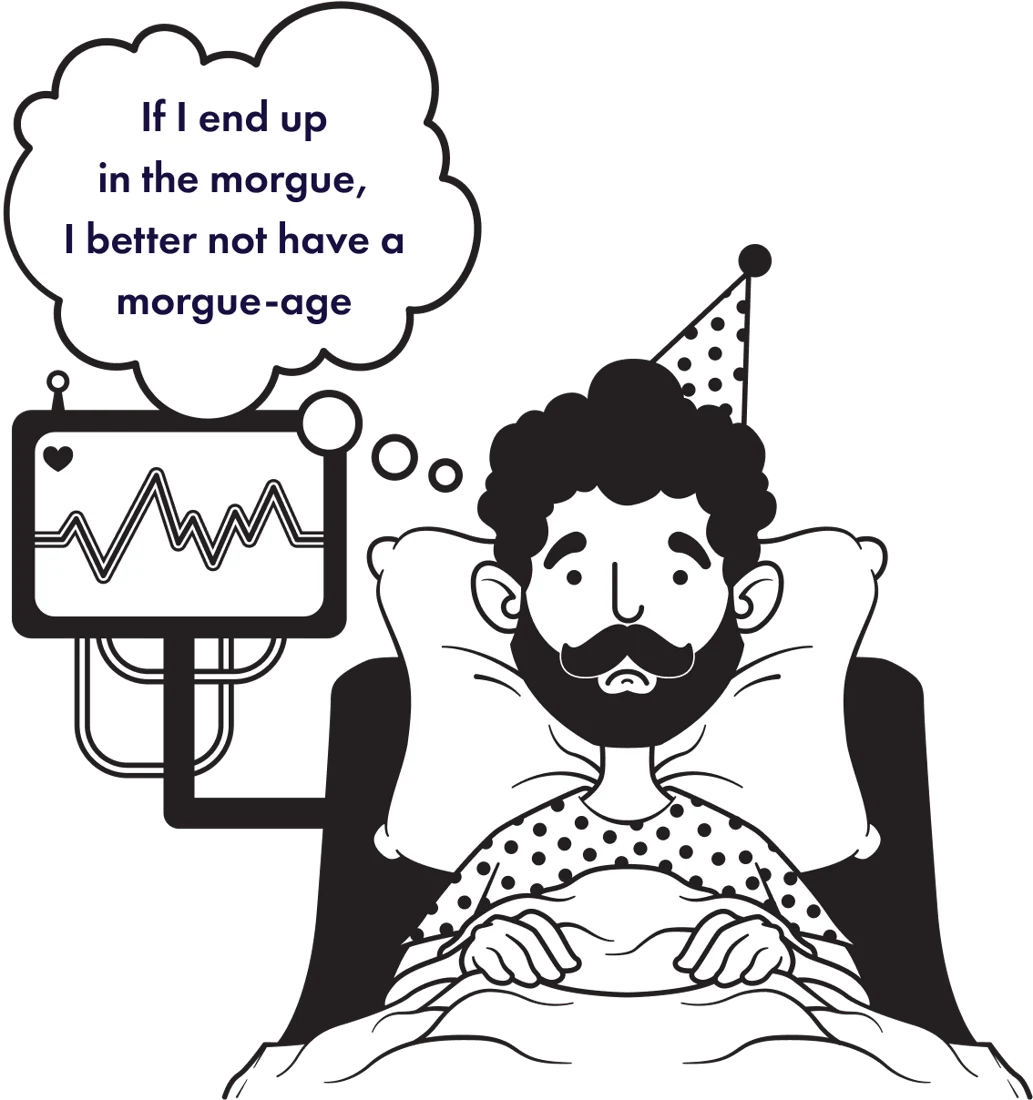
Critical Illness
A lump sum on diagnosis, so recovery comes before bills.
- Support when it’s needed most
- A wide range of conditions
- Recovery, not money worries
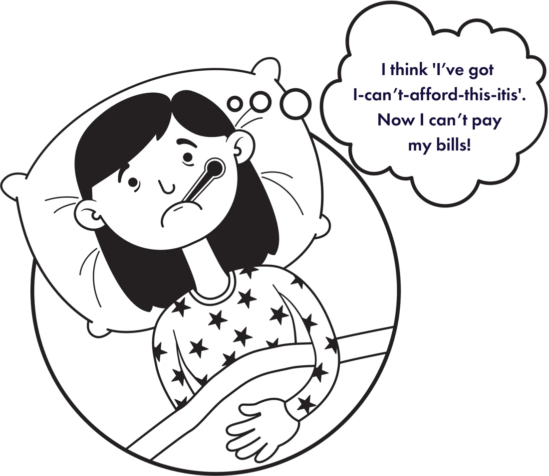
Income Protection
Monthly payments if illness or injury stops you working.
- Monthly payments while off sick
- Most illnesses and injuries
- Unlimited claims
How It Was Built
We created a bespoke website that combines structured financial credibility with personality-led design, ensuring the Precise Life brand feels professional and human.
User Experience
Distinctly clear service segmentation and a straightforward quote journey guide users from understanding their options to submitting an enquiry.
Mobile Responsive
Layouts, illustrations, and form elements were are mobile responsive to remain clear and easy to use across all devices and screen sizes.
Interactive Design
WhatsApp integration and streamlined form fields make it easy for visitors to get in touch quickly.
"They really helped me bring my vision to life, guided me through the journey, and made it a reality. I would highly recommend them."

Adam Carew
Director, Precise Life
Branding
The Mark
The Logo
The wordmark features the distinctive pinpoint detail replacing the dot of the “i,” reinforcing the brand’s promise of accuracy and tailored guidance.
What Inspired The Logo Concept?
The logo plays on the word "Precise" by transforming the dot of the "i" into a pinpoint marker, reinforcing the idea of accuracy and tailored guidance.
What Is The Brand Marque And How Is It Used?
The pinpoint element forms a flexible marque that can be used independently across icons, social media, and supporting brand graphics.
Two Colours Only
The logo is only ever white or Dark Blue, chosen for its background so it always reads clearly. Try them.
The Type
Two Typefaces
Urbanist is used for headings to keep the brand feeling modern, clean, and approachable.
Futura
Futura supports body text for clarity and readability.
Headline Treatment
Headlines are mostly Urbanist Light, with the key words lifted in Medium; body copy sits in Futura Light, and calls to action in Futura Regular.
The Colour
The Palette
A foundation of deep and light blues signals trust and professionalism, while a bold red accent introduces energy for highlights and calls to action.
Three Core Colours
Dark Blue, Light Blue and Pure White carry the identity, and are used most prominently everywhere it appears.
Two Accents, Sparingly
Bright Red and Bright Green are for highlights and buttons only, and green never sits on Light Blue, for legibility.
The Marque As A Device
A Watermark
Behind content, the marque becomes a watermark: a gradient feather fades out half of the shape, at a gentle opacity.
On Every Ground
The same treatment works on Light Blue and white, so pages gain depth without competing with the copy. Try them.
The Illustrations
A Cast Of Characters
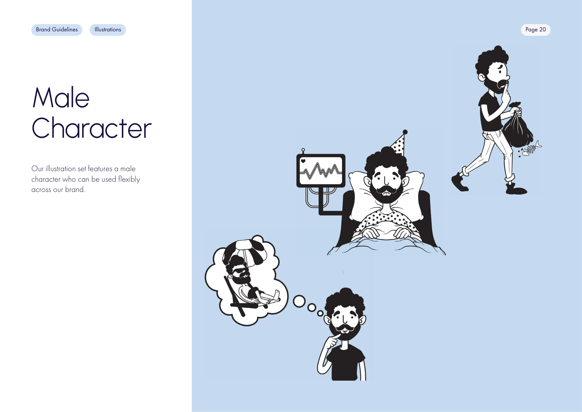
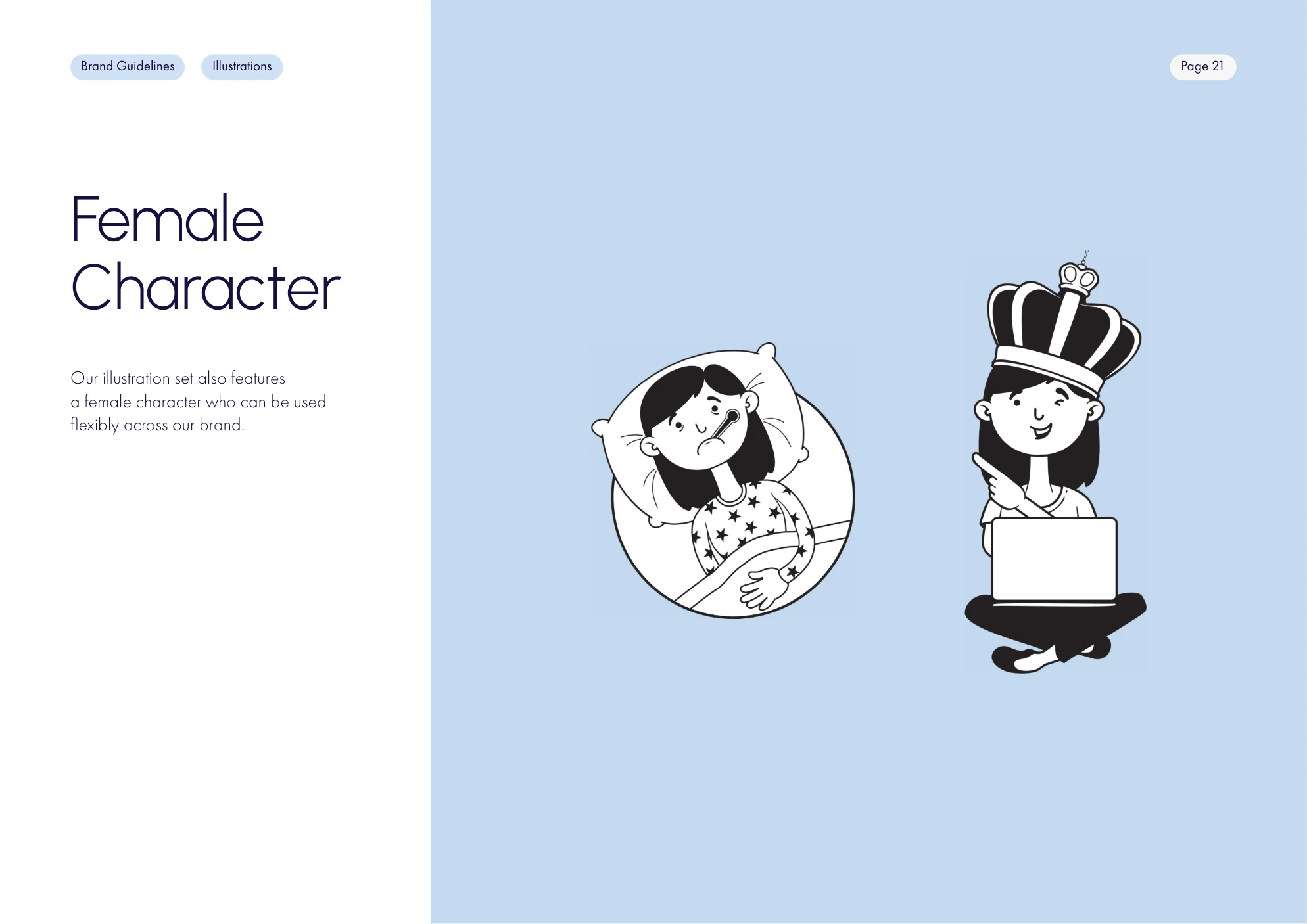
In place of stock photography, an illustration set in dark grey and white, on light blue or white, brings warmth and humour to a serious subject.
Flexible By Design
A male and a female character carry the set, so the brand can tell new stories as its services grow.
The Brand In Use
Social Media Posts
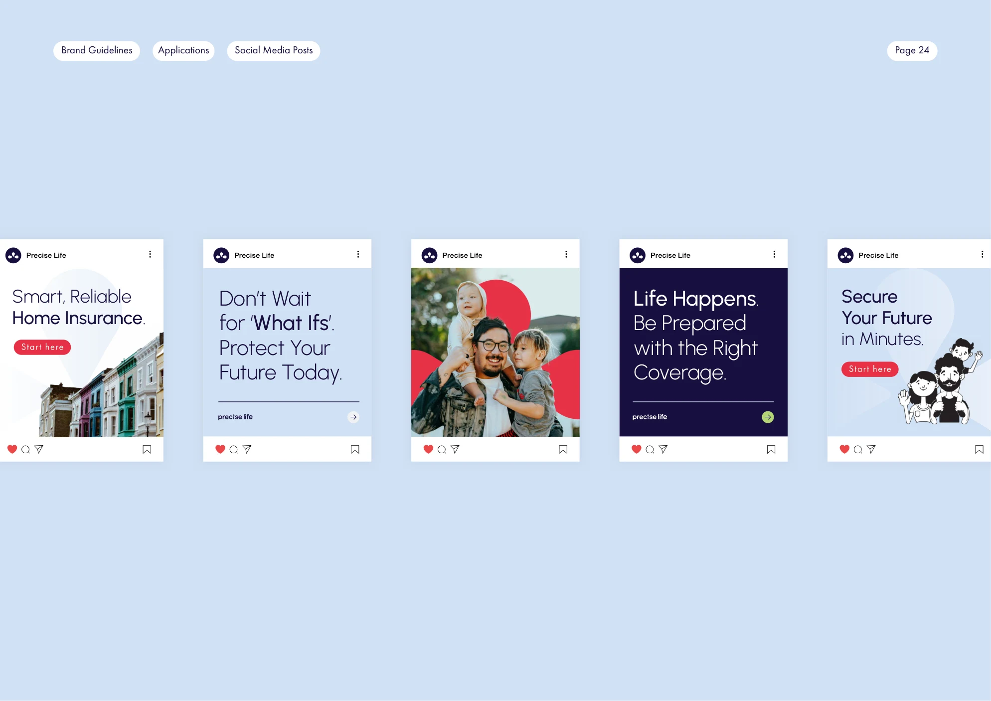
Post templates set the headline treatment, the device and the illustrations to work together on social.
Presentations
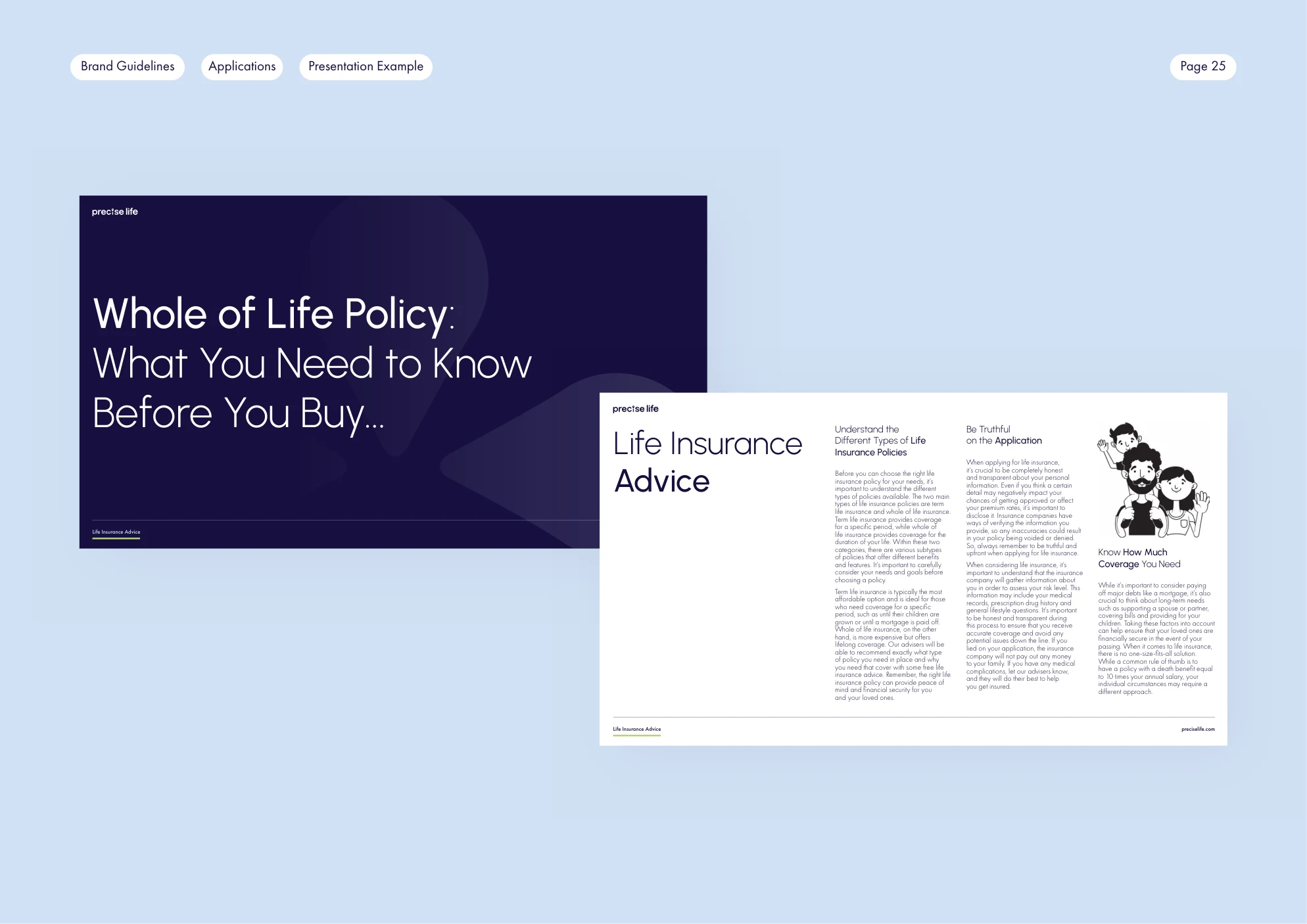
A presentation template carries the same voice into advice documents and client meetings.