Our Work/Novatus Global
Novatus Global.
Novatus Global is a market-leading RegTech consultancy and SaaS provider helping financial services firms deliver accurate, complete, and timely transaction reporting across global regimes.
- Services
- Branding, Web Design
- Sector
- Financial Services, RegTech, SaaS
Novatus Global supports financial services firms across critical regulatory and risk areas including transaction reporting, operational resilience, ESG, compliance, and authorisations.
We redesigned and built a high-credibility website that clearly presents their services and showcases their award-winning En:ACT platform.
The result is a structured website that improves clarity, navigation, and enquiry journeys while supporting long-term organic visibility.
Website Design
The Platform, On The Homepage
Novatus’s En:ACT platform leads the site. Each capability is a card you can explore without leaving the page.
The Platform, Card By Card
Each En:ACT capability gets a card of its own, so a reporting team finds the problem it has before it reads a word of sales copy.
Explored In Place
The carousel lets a visitor see the whole platform from the homepage, without opening six pages.
A Page Behind Every Card
Every card leads to its own solution page, and the platform has a home of its own one click away.
Platform
En:ACT Solutions
Accurate, complete and timely transaction reporting.
Submission file reconciliations
Checks every submission file for accuracy and completeness.
Find Out MoreSource system and submission file reconciliation
Reconciles from source data right through to the reports that land.
Find Out MorePre-submission file assurance
Finds and fixes errors before a report is ever submitted.
Find Out MoreDelegated reporting oversight
Checks what managers and brokers report on a firm’s behalf.
Find Out MoreUAT Testing
Proves submissions stay accurate through organisational or regulatory change.
Find Out MoreBack reporting
Corrects late or erroneous reports, keeping the record whole.
Find Out More
Services, Two Ways
Novatus sells expertise and also runs it for clients. The homepage separates the two. Switch between them, or open a service.
Two Ways To Buy
Professional services or managed services: one switch shows a buyer the half that fits how they want to work.
One Open At A Time
Each service opens in place, marked with the brand’s asterisk, with a line on what it covers and a route to its page.
Our Services:
Professional Services:
From application to approval, including regulatory business plans and financial analysis.
Find Out MoreExpert guidance on meeting regulatory obligations, day to day.
Find Out MoreBuilding and proving the operational resilience regulators expect.
Find Out MoreIdentifying, assessing and managing risk across the firm.
Find Out MoreComplete, accurate reporting across global regimes.
Find Out MoreBringing ESG into strategy, reporting and governance.
Find Out MoreChange programmes shaped around regulation and growth.
Find Out More
Managed Services:
Risk and compliance, delivered as a service.
Find Out MoreReporting run for the firm, accurately and on time.
Find Out MoreOngoing controls against financial crime.
Find Out MoreData and reporting operations that inform decisions.
Find Out MoreAssessing the sustainability risks of investments.
Find Out More
How It Was Built
We built a high-performance WordPress website that highlights the En:ACT platform, strengthens credibility signals, and makes it easy for users to explore services and insights.
User Experience
Clear page hierarchy, intuitive navigation, and streamlined service and team discovery help users find relevant information quickly and take action.
Mobile Responsive
Responsive layouts ensure interactive elements such as carousels, menus, and featured updates remain smooth and accessible across all devices.
Interactive Design
Dynamic elements including solution carousels, navigable insight highlights, and a premium mega menu create a more engaging experience while keeping the user journey simple and clear.
"They understood our requirements quickly despite not being from our industry. They correctly and politely pushed back on a decision we thought made sense that would have impaired the website. Everything was delivered on time, and they were instantly responsive to our needs. They even changed copy whilst I waited on the phone!"

Mark Ellis
CRO — Novatus Global
Branding
The Mark
The Logo
The logo combines a clean wordmark with a distinctive marque to create a modern, professional identity that remains legible across digital and print. The marque also functions independently as a recognisable brand asset.
What Is The Brand Marque And How Is It Used?
The marque is an asterisk-style symbol with a subtle directional arrow, used both within the logo and as a supporting graphic device across the wider brand system.
On Every Ground
The logo works in Blue 01 or in white, across the blues and the apricots. Try them.
The Type
One Typeface
Neue Haas Grotesk is used across headings and body copy to maintain clarity and consistency at all sizes. Font weights are applied thoughtfully to create a strong hierarchy and polished finish.
The Hierarchy
Roman carries most of the text, and Medium pulls out the key words, often in Blue 02 or Apricot on Blue 01, so the phrase that matters lands first.
The Colour
The Palette
The primary palette combines deep and mid-tone blues with apricot accents to create a professional yet approachable brand presence. Secondary colours are used sparingly as supporting highlights rather than dominant brand elements.
Three Blues
The cool side of the palette: professional, steady, and the ground for most of the brand.
Three Apricots
The warm side, which makes a regulatory consultancy feel approachable.
Four For Data
A secondary set, used in small amounts for graphs, statistics and categories, and never for the logo.
The Marque As A Device
At The Corners
As a background, the asterisk sits at a corner of the layout, so only part of it shows and it never disturbs the alignment of anything else.
Set Pairings
Each ground has its device colour and transparency, from 5% on white to 20% on the lighter tones. Try them.
The Brand In Use
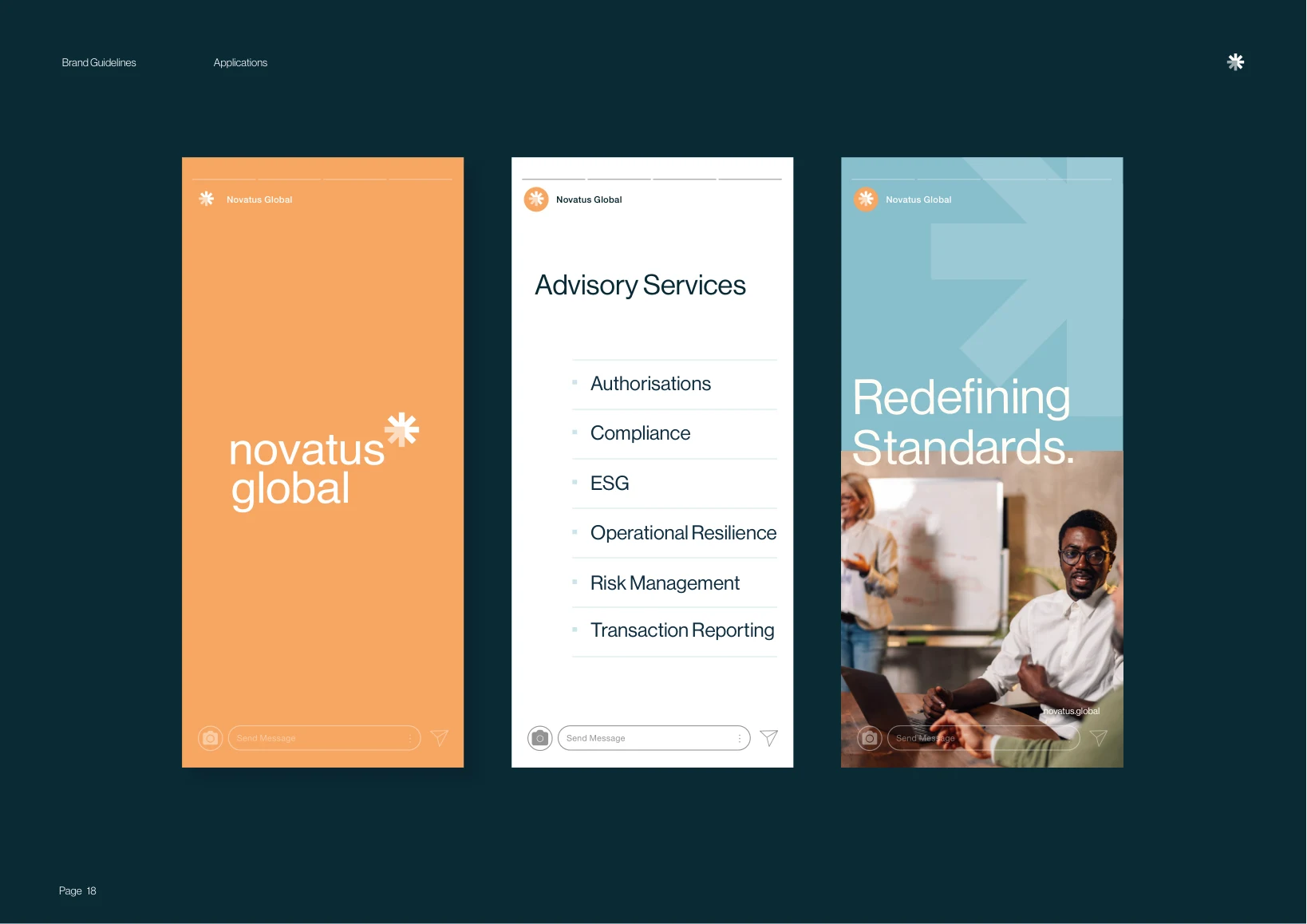
Social Media
Story templates in the brand’s apricots and blues, with the asterisk at work, carry Novatus’s services and news into social.