BGI.
Global capital advisory firm connecting high-growth ventures with strategic investors across international markets.
Global capital advisory firm connecting high-growth ventures with strategic investors across international markets.
Bryn Group Investments (BGI) is a specialist fundraising consultancy working with ambitious ventures across sectors, including e-mobility, energy storage, disruptive technology, and sustainability.
We delivered a complete brand identity and website redesign that positions BGI as a high-end capital advisory partner connecting ventures with global investment networks.
The result is an online presence that clearly communicates the firm’s credibility and strategic role in facilitating investment relationships.
We designed a website that presents BGI’s capital advisory work with clarity and authority, guiding visitors through the firm’s Funding Relationship Management approach.
The structure and messaging emphasise strategic thinking and professionalism while speaking directly to founders, advisors, and investors evaluating potential partners.
The website balances sustainability-driven visual storytelling with a sharp corporate tone, ensuring it resonates with both founders seeking capital and institutional investment partners. Visual restraint and structured messaging reinforce BGI’s positioning as a results-focused advisory firm.
The mobile experience keeps navigation simple and content easy to read, allowing visitors to explore services and request a consultation with ease from any device.
User Experience
Simple navigation and structured content flow guide users naturally through BGI’s proposition and capital advisory methodology.
Mobile Responsive
Layouts, typography, and content hierarchy were optimised to maintain impact and legibility across mobile, tablet, and desktop devices.
Interactive Design
Subtle graphic devices and layered visual elements introduce depth and visual interest while maintaining a clean and professional aesthetic.
The team's personability, understanding of our culture, and their care and passion for our project impressed us.

Roy Davies
Business Relationship Manager
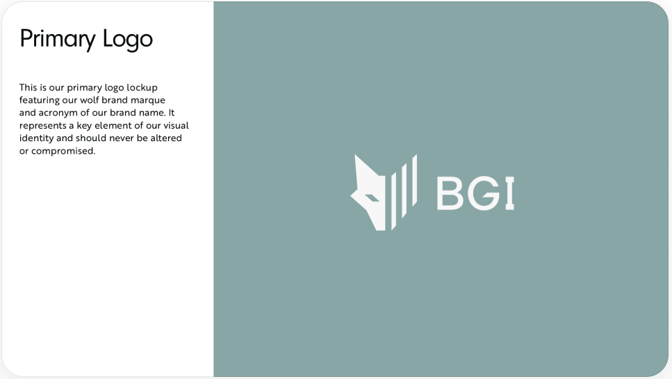
We developed a distinctive brand identity centred around a wolf marque, symbolising agility, discipline, and determination within global fundraising and capital advisory.
The identity balances strength with sophistication, aligning the “investment hunter” concept with financial credibility and strategic precision.
The split wolf marque creates a strong visual metaphor, combining instinct and data-driven intelligence within a single symbol. Graphic devices derived from the angular forms of the logo are applied across the site to influence layout structure and reinforce brand consistency.

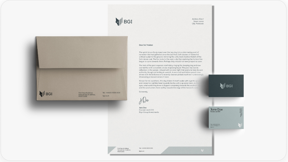
We developed brand guidelines covering logo usage, typography, colour hierarchy, and graphic device application to ensure consistency across all print and digital materials.
Logo
The logo combines a clean wordmark with a distinctive wolf marque to create an unmistakeably recognisable identity. The split construction of the symbol represents the balance between instinct and analytical market intelligence.
Typeface
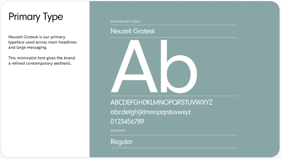
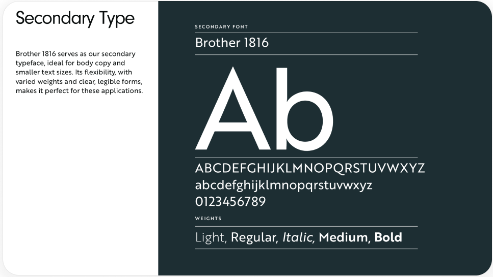
Neuzeit Grotesk is used for lead messaging and headlines to deliver a clean, contemporary tone, while Brother 1816 supports body content with clarity and readability.
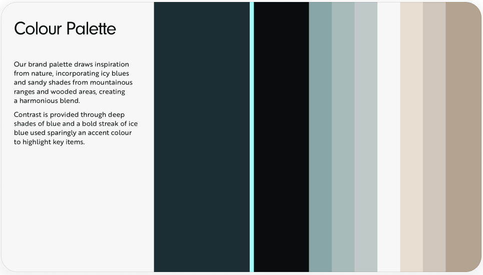
Colour Palette
Forest green forms the foundation of the brand, supported by mist blues and sand tones for balance. Ice blue is used sparingly as an accent colour to highlight key elements and calls to action.