Novatus Global.
Novatus Global is a market-leading RegTech consultancy and SaaS provider helping financial services firms deliver accurate, complete, and timely transaction reporting across global regimes.
Novatus Global is a market-leading RegTech consultancy and SaaS provider helping financial services firms deliver accurate, complete, and timely transaction reporting across global regimes.
Novatus Global supports financial services firms across critical regulatory and risk areas including transaction reporting, operational resilience, ESG, compliance, and authorisations.
We redesigned and built a high-credibility website that clearly presents their services and showcases their award-winning En:ACT platform.
The result is a structured website that improves clarity, navigation, and enquiry journeys while supporting long-term organic visibility.
We refreshed the Novatus Global website to deliver a sleek, modern experience aligned with the expectations of financial services decision-makers.
The design prioritises clear messaging and strong visual hierarchy so visitors can quickly understand the En:ACT platform and the consultancy services that support it.
The website structure carefully balances SaaS and consultancy messaging, ensuring En:ACT remains clearly positioned while professional services are still easy to discover and understand. We also strengthened expertise signals through a streamlined “Meet the Team” experience that reinforces credibility for regulated buyers.
Mobile layouts were designed to keep key content prominent, including the homepage spotlight and En:ACT carousel, allowing users to swipe through solutions and navigate easily on smaller screens.
User Experience
Clear page hierarchy, intuitive navigation, and streamlined service and team discovery help users find relevant information quickly and take action.
Mobile Responsive
Responsive layouts ensure interactive elements such as carousels, menus, and featured updates remain smooth and accessible across all devices.
Interactive Design
Dynamic elements including solution carousels, navigable insight highlights, and a premium mega menu create a more engaging experience while keeping the user journey simple and clear.
"They understood our requirements quickly despite not being from our industry. They correctly and politely pushed back on a decision we thought made sense that would have impaired the website. Everything was delivered on time, and they were instantly responsive to our needs. They even changed copy whilst I waited on the phone!"

Mark Ellis
CRO — Novatus Global
We created a modern corporate identity that reflects Novatus Global’s expertise in navigating complex financial and regulatory challenges.
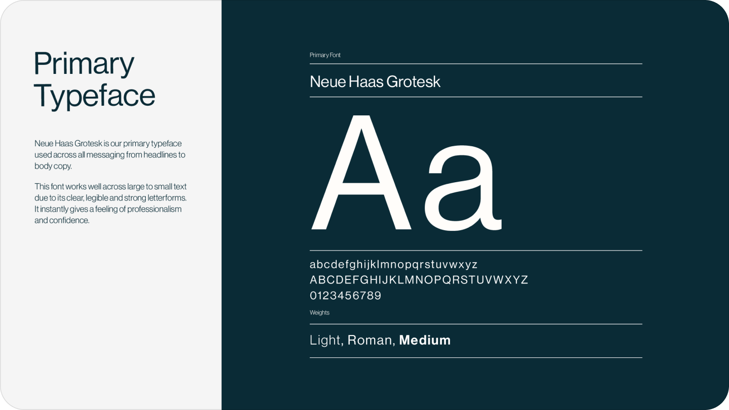
The system includes a refined logo suite, a clear typographic hierarchy, and a flexible colour palette designed for consistent use across digital and print.
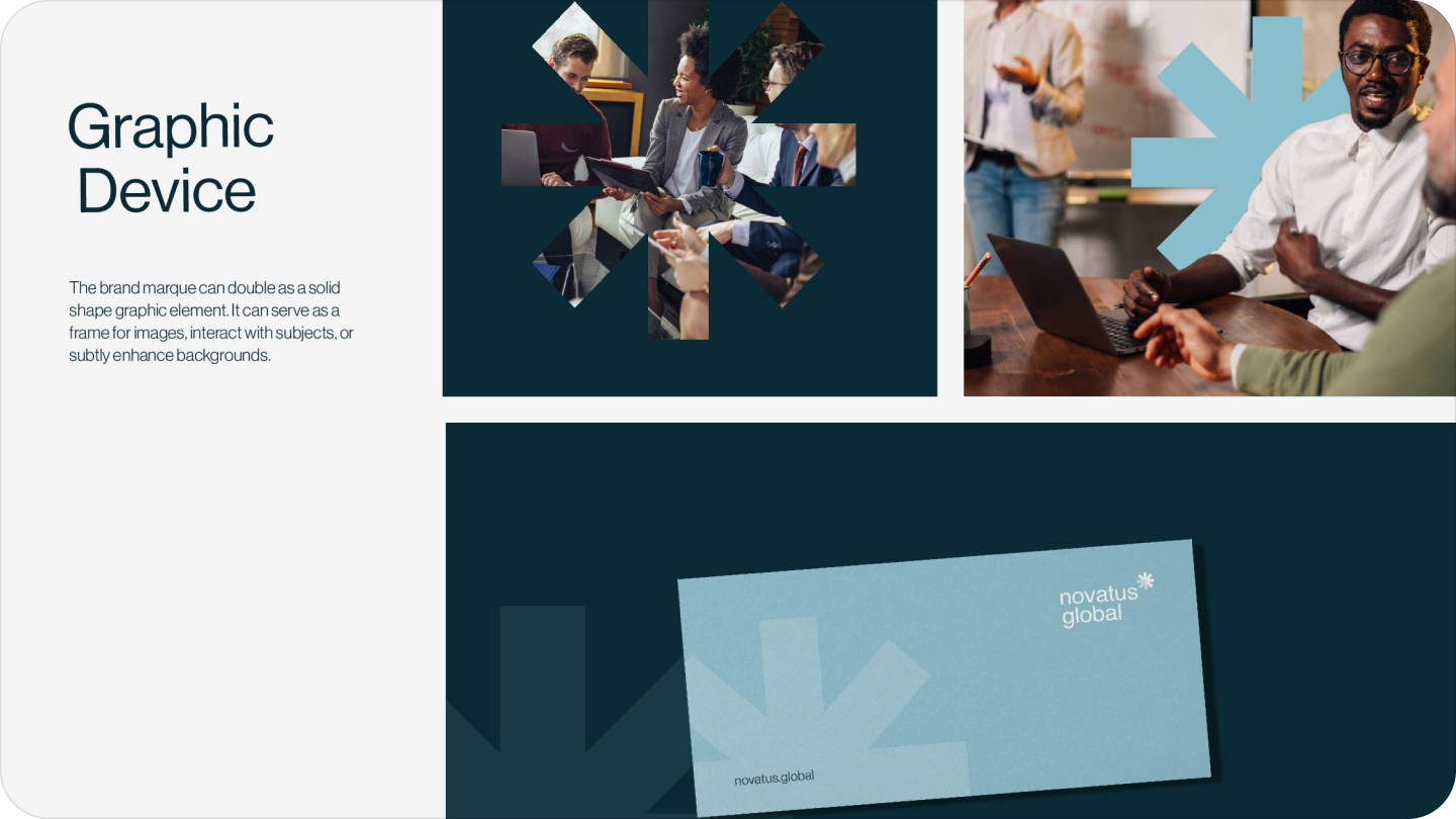
The colour palette and typography were applied carefully so the website feels elevated and corporate while remaining distinctly recognisable. Graphic devices derived from the brand marque are used subtly across layouts to reinforce visual consistency and brand recognition.
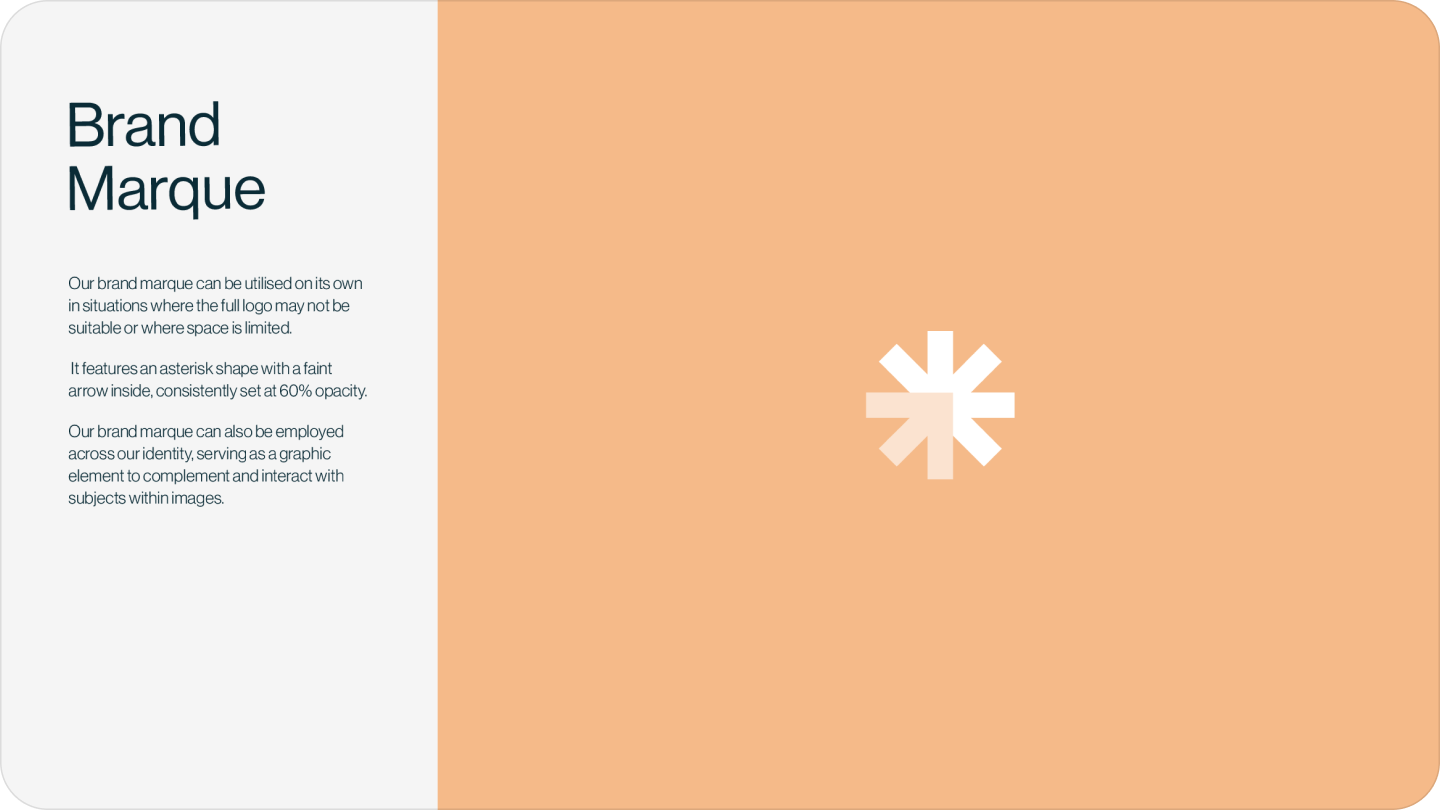
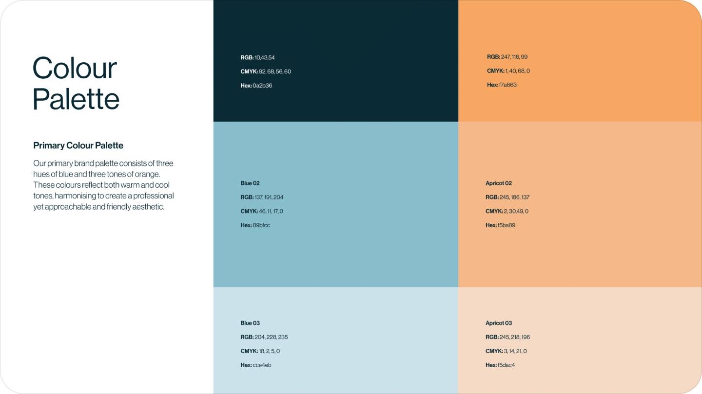
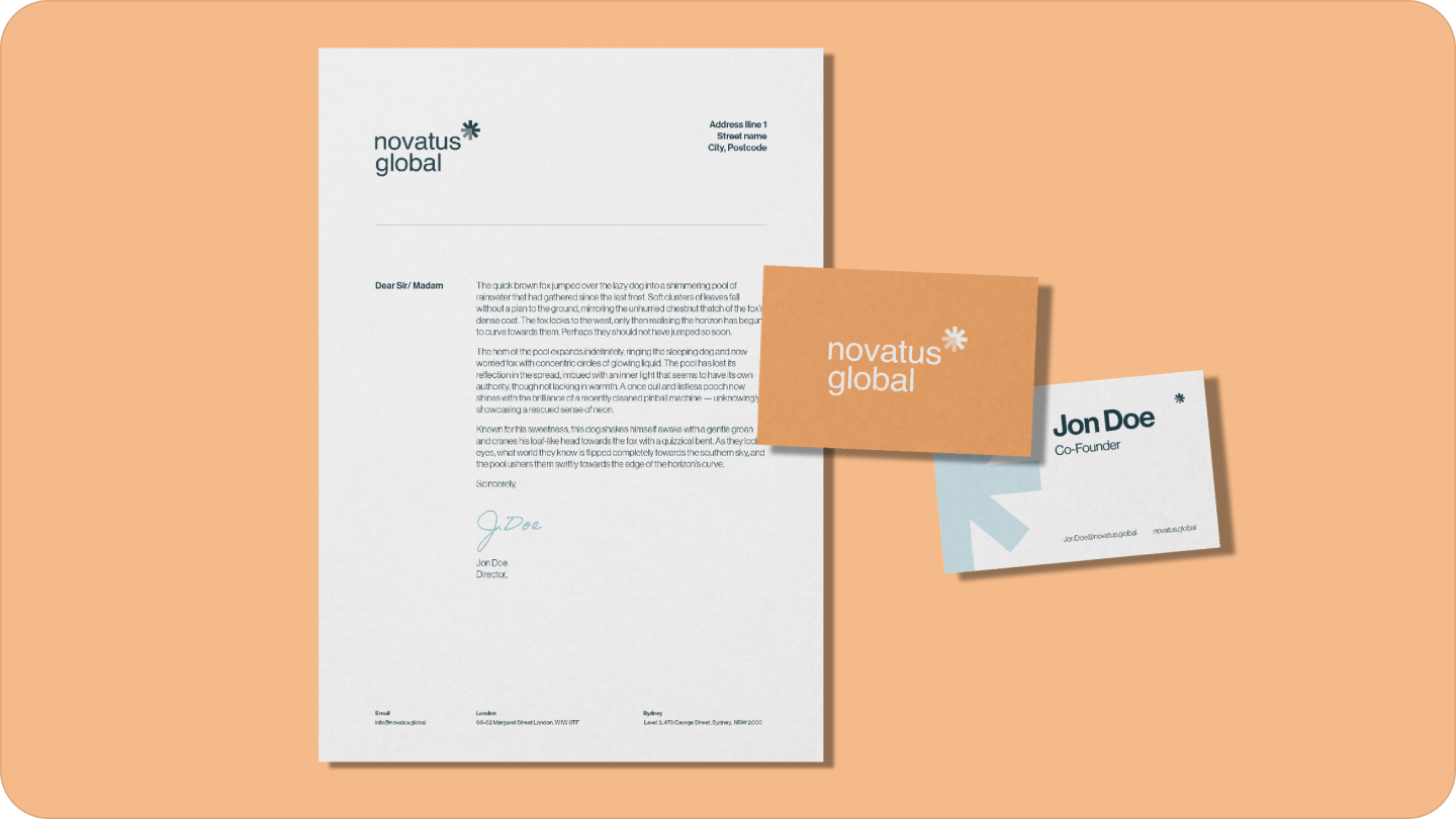
We delivered visual brand guidelines so the Novatus Global team can maintain consistency across logo usage, typography, colour application, and brand elements moving forward.
Logo
The logo combines a clean wordmark with a distinctive marque to create a modern, professional identity that remains legible across digital and print. The marque also functions independently as a recognisable brand asset.
Typeface
Neue Haas Grotesk is used across headings and body copy to maintain clarity and consistency at all sizes. Font weights are applied thoughtfully to create a strong hierarchy and polished finish.
Colour Palette
The primary palette combines deep and mid-tone blues with apricot accents to create a professional yet approachable brand presence. Secondary colours are used sparingly as supporting highlights rather than dominant brand elements.