Precise Life.
Independent insurance broker providing clear, tailored protection solutions across life, mortgage, income, and critical illness cover.
Independent insurance broker providing clear, tailored protection solutions across life, mortgage, income, and critical illness cover.
As an insurance broker, Precise Life needed a brand identity and website that stood apart from the typically corporate and jargon-heavy insurance market.
We developed a full brand identity and a bespoke website centred around clear messaging, service-led illustrations, and a confident but approachable tone.
The result is a distinctive digital platform that simplifies complex products while making the brand memorable and easy to engage with.
We created a website that balances credibility and personality using customised illustrations and structured page layouts to make cover types easy to understand.
Each core service is supported by its own page and illustration, helping visitors quickly understand the different offerings while maintaining brand alignment across the site.
The illustration approach was designed to make serious financial topics feel approachable while maintaining credibility. The site structure keeps visitors focused on key decisions with clear navigation and strong calls to action throughout the site.
Fully mobile optimised, the design remains clean and fast, with illustrations scaling naturally and the quote journey staying simple and accessible.
User Experience
Distinctly clear service segmentation and a straightforward quote journey guide users from understanding their options to submitting an enquiry.
Mobile Responsive
Layouts, illustrations, and form elements were are mobile responsive to remain clear and easy to use across all devices and screen sizes.
Interactive Design
WhatsApp integration and streamlined form fields make it easy for visitors to get in touch quickly.
"They really helped me bring my vision to life, guided me through the journey, and made it a reality. I would highly recommend them."

Adam Carew
Director, Precise Life
A complete brand identity was crafted around clarity, precision, and recognisability within the insurance space.
The visual system combines a clean wordmark, a distinctive pinpoint motif, and a modern colour palette designed to feel unique, yet trustworthy.
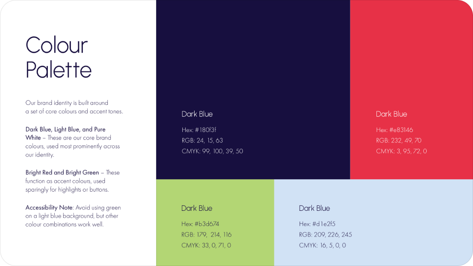
The brand palette was designed to feel clean and trustworthy, using a strong primary blue foundation supported by lighter tones and a confident accent red. The visual system ensures the brand feels consistent across print and digital materials.
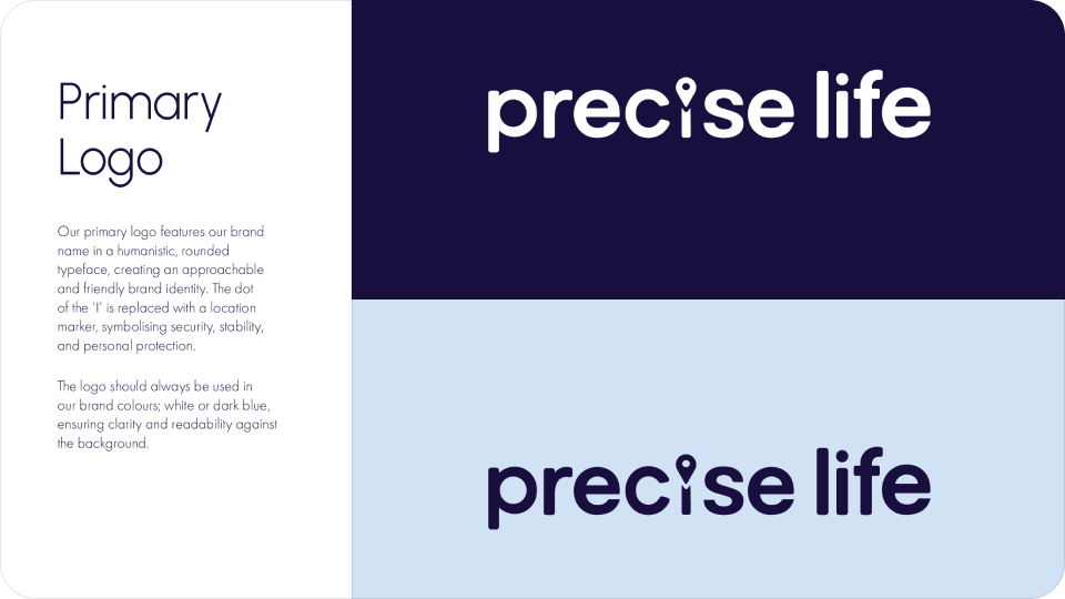

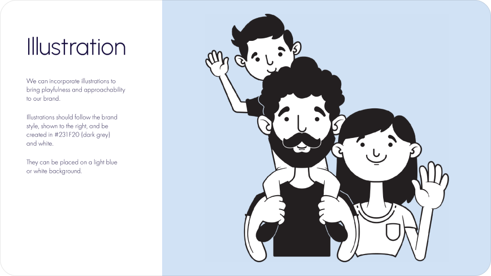
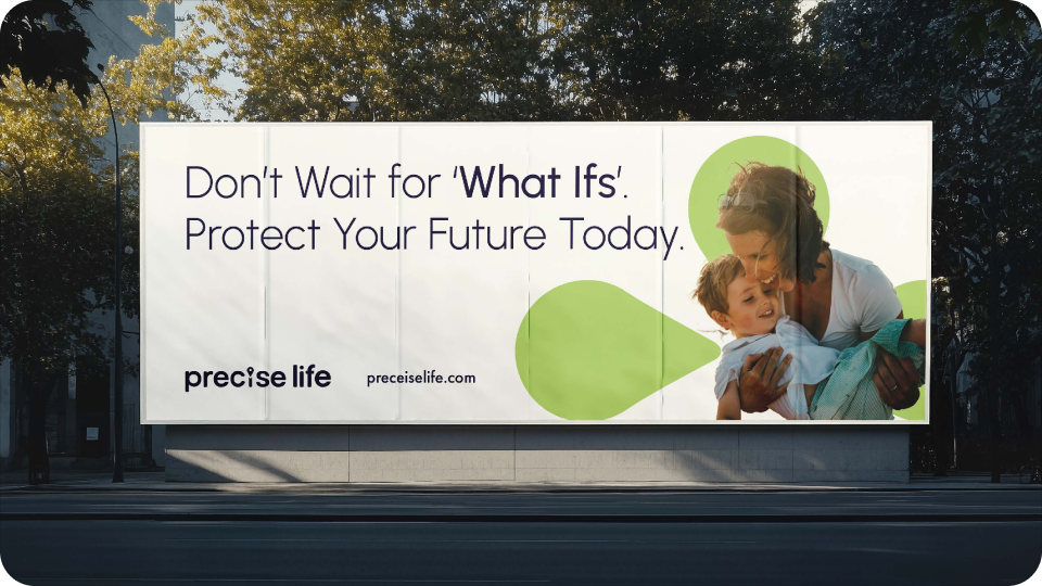
We developed visual brand guidelines to ensure consistency across logo usage, typography hierarchy, colour application, illustration styling, and digital assets.
Logo
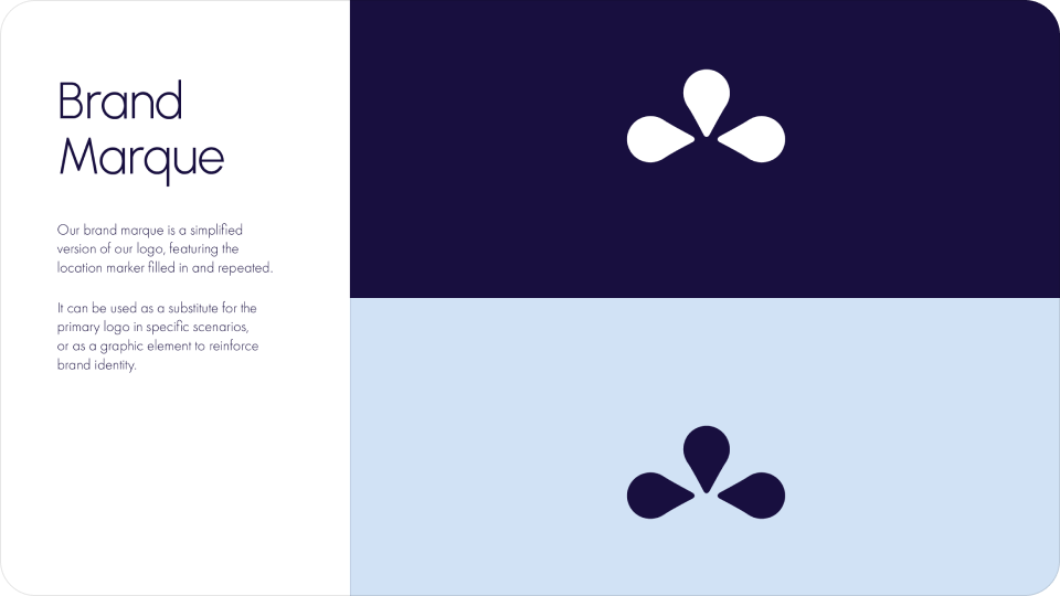
The wordmark features the distinctive pinpoint detail replacing the dot of the “i,” reinforcing the brand’s promise of accuracy and tailored guidance. A secondary marque built from the pinpoint element provides a more compact icon for smaller applications.
Typeface
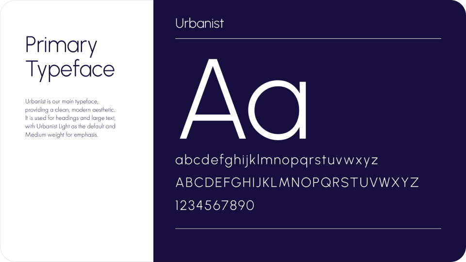
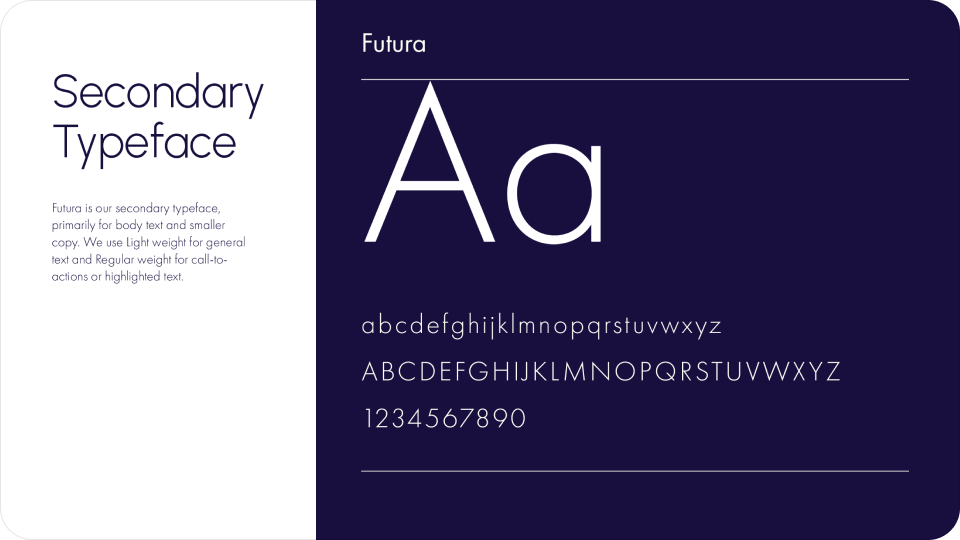
Urbanist is used for headings to keep the brand feeling modern, clean, and approachable, while Futura supports body text for clarity and readability.
Colour Palette
A foundation of deep and light blues signals trust and professionalism, while a bold red accent introduces energy for highlights and calls to action.